

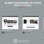
In the fast-paced digital era, selecting the right website theme can make or break your online presence. A responsive, feature-rich theme not only delivers a seamless experience across all devices but also reinforces your brand identity and keeps visitors engaged. Whether you’re launching a blog, e-commerce store, portfolio, or corporate site, the theme you choose should balance aesthetics, performance, and usability. In this comprehensive guide, we’ll explore the 10 best responsive website themes. We’ll highlight their standout features, ideal use cases, and tips to help you pick the perfect design foundation for your next web project.
Astra

Astra continues to dominate the theme market thanks to its lightweight architecture and extensive customization options. Built for speed, this theme loads in under half a second and scores near-perfect marks on performance tests. Astra seamlessly integrates with popular page builders like Elementor and Beaver Builder, enabling you to craft unique layouts without touching a single line of code.
- Lightweight and fast-loading, under 50KB
- 140+ pre-built starter templates
- Deep integration with WooCommerce
- Advanced typography and color controls
Divi
Divi by Elegant Themes offers an all-in-one design framework powered by its proprietary visual builder. It’s highly versatile, making it ideal for businesses and agencies that demand total creative freedom. With Divi’s drag-and-drop interface, you can create dynamic layouts, customize animations, and apply global design settings across your entire site.
- True visual building experience
- 800+ pre-made designs
- Split testing and conversion optimization tools
- Role editor for team collaboration
OceanWP
OceanWP remains a top choice for developers seeking a highly extendable and e-commerce ready theme. Its modular structure lets you enable or disable features as needed, which keeps your site lean. Plus, OceanWP offers built-in support for popular plugins like Elementor, WPBakery, and Yoast SEO, ensuring compatibility and performance.
- Native WooCommerce enhancements
- Responsive and RTL ready
- Customizable header styles
- Premium extensions library
GeneratePress
GeneratePress is built with a mobile-first approach and focuses on speed and usability. Its modular design allows you to activate only the features you need, resulting in minimal bloat. The theme’s premium add-on gives you access to advanced controls for layout, typography, colors, and WooCommerce integration, making it a favorite for performance-driven sites.
- Under 30KB gzipped for lightning-fast load times
- Block editor optimized
- Extensive hook system for developers
- Accessibility-ready and schema-friendly
Neve
Neve by ThemeIsle is designed for flexibility and speed, providing a range of starter sites for blogs, small businesses, and online stores. It features a header and footer builder, advanced typography, and color customization options. Neve is optimized for AMP, ensuring your content loads instantly on mobile devices.
- AMP and mobile-first design
- Header/Footer builder
- Schema markup support
- Seamless page builder integration
Hestia
Hestia is a modern one-page theme that caters to startups and small businesses. Featuring a clean material design, it offers sections for services, testimonials, portfolios, and team members. Hestia integrates with WooCommerce and Elementor to expand its functionality for online stores and custom layouts.
- One-page and multi-page options
- Live theme customizer
- Translation and RTL ready
- Compatibility with major plugins
Avada
Avada is the bestselling theme on the ThemeForest marketplace, thanks to its all-encompassing Fusion Builder and dozens of pre-built websites. It serves a broad range of industries, from photography and restaurants to e-commerce, with detailed demo content that can be imported in seconds.
- Fusion Builder drag-and-drop editor
- 60+ premium design elements
- Advanced theme options panel
- Lifetime updates and support
Salient
Salient stands out with its cutting-edge animations, video backgrounds, and Retina-ready visuals. Ideal for creative agencies and portfolios, this theme offers high-impact demos and a tailored version of WPBakery Page Builder, enabling you to craft immersive user experiences without compromise.
- Advanced parallax scrolling
- 120+ demo templates
- High-performance optimized code
- Integrated newsletter subscription module
TheGem
TheGem is a versatile theme built for performance and creativity. With over 400 creative templates spanning corporate, portfolio, and e-commerce niches, it offers robust styling options, adaptive images, and flexible grid systems. TheGem’s emphasis on clean code and SEO optimization ensures your site ranks well out of the box.
- 400+ pre-built design concepts
- Built-in SEO tools
- Adaptive images for speed
- Extensive typography library
X Theme
X Theme features the unique Cornerstone page builder and four distinct design stacks: Integrity, Renew, Icon, and Ethos. Its powerful global styling options and dynamic content widgets make it a top pick for professionals who need design variety and granular control over every element on the page.
- Four built-in design stacks
- Cornerstone front-end editor
- Global theme options
- Advanced customizability with extensions
How to Choose the Right Theme for Your Project

With so many top-tier options available, narrowing down your choice can be challenging. Here are a few tips to guide your decision:
- Define your primary goal: blog, e-commerce, portfolio, or corporate site.
- Prioritize performance metrics: page speed, mobile UX, and accessibility.
- Check compatibility with essential plugins and page builders.
- Evaluate customization ease: live customizer vs. page builder.
- Review support and update frequency for long-term security.
Conclusion
Choosing the right responsive website theme sets the stage for a successful online presence. Whether you need unmatched speed from GeneratePress, the visual power of Divi, or the creative flair of Salient, top themes offer something for every project. Evaluate your needs, test a few demos, and select a theme that balances design, performance, and user experience. With one of these ten themes as your foundation, you’ll be well on your way to building a site that looks stunning and works flawlessly across all devices. Learn more about How to Choose the Perfect Website Theme.


No Comments