

In the dynamic world of web design, staying ahead with flexible, efficient, and visually appealing themes is crucial. Traditional monolithic themes often lock you into a rigid structure, making customization cumbersome and updates risky. Enter modular website themes: a revolutionary approach to theme design that breaks down user interfaces into discrete, reusable components. These components—ranging from headers and footers to call to action blocks and image galleries—can be assembled and reassembled to craft bespoke layouts without writing extensive code from scratch. As businesses demand faster turnaround times and marketers seek brand consistency across multiple touchpoints, modular themes have become the go to solution for modern websites.
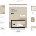
What Are Modular Website Themes?

At their core, modular website themes are built around the concept of component based design. Instead of bundling all styles and templates into a single, inflexible package, modular themes break down the user interface into small, self contained modules. Each module encapsulates specific functionality such as a navigation menu, testimonial slider, or newsletter signup form, and includes its own markup, styles, and scripts. This modular architecture aligns with the principles of modern frontend frameworks like React, Vue, and Angular, making it easier to integrate these themes into headless CMS environments. Developers can pick and choose modules, customize them independently, and even develop new modules as needed, fostering a highly maintainable and scalable codebase. The result is a more streamlined workflow where design consistency and brand guidelines are enforced at the component level, reducing the risk of style drift and code duplication.
Benefits of Modular Themes
Modular themes offer a multitude of advantages over their monolithic counterparts. Here is a closer look at why forward thinking teams are embracing this approach:
- Enhanced Flexibility: Rapidly prototype by mixing and matching modules, enabling A/B testing of different layouts without disrupting the core structure.
- Accelerated Development: Pre built modules act as building blocks, significantly reducing development time by eliminating the need to code common components from scratch.
- Performance Optimization: Load only the modules required for each page. This granular approach minimizes HTTP requests and CSS/JS payloads for faster page loads.
- Scalability and Maintainability: Update or replace individual modules without affecting unrelated parts of the site, streamlining long term maintenance.
- Design Consistency: Enforce global styles and design tokens within each module to ensure a unified look and feel across the entire website.
Key Features to Look
When evaluating modular themes for your next project, prioritize themes that incorporate the following features to maximize your return on investment:
- Drag and Drop Page Builders: Themes should integrate with powerful page builder plugins or include their own visual interfaces for intuitive module placement and property adjustments.
- Responsive, Mobile First Design: Modules must adapt seamlessly to all screen sizes, ensuring an optimal experience on smartphones, tablets, and desktops.
- Accessibility and WCAG Compliance: Look for themes that provide semantic HTML, keyboard navigation support, ARIA attributes, and sufficient color contrast for inclusivity.
- Advanced Typography and Color Controls: Robust theme panels should let you configure global or module specific typography styles and color palettes without writing code.
- Plugin and Integration Compatibility: Verify seamless operation with e-commerce, SEO, multilingual, and analytics plugins to ensure extensibility as needs evolve.
- Performance and SEO Tools: Features like lazy loading, optimized image handling, schema markup, and critical CSS generation can boost search rankings and engagement.
How to Choose the Right Modular Theme for Your Project
Selecting the perfect modular theme requires a balanced assessment of both design and technical criteria. Follow these steps to make an informed choice:
- Define Project Scope and Objectives: Document your website’s primary goals—lead generation, e-commerce sales, or content publishing—and establish performance benchmarks such as load time and uptime requirements.
- Assess Design Requirements: Gather branding guidelines, mood boards, and UI reference sites. Identify essential modules—hero sections, galleries, pricing tables—and ensure the theme’s offerings align with your vision.
- Evaluate Customization Flexibility: Check for child theme support or a customization API to preserve customizations during theme updates and implement unique design elements.
- Review Documentation and Support: Quality documentation, tutorial videos, active forums, and responsive developer support can drastically reduce onboarding and troubleshooting time.
- Test Responsiveness and Performance: Use demo sites to conduct live tests on various devices and network conditions. Evaluate module behaviour under different viewports and performance tuning options.
- Check Licensing and Update Policies: Choose themes with clear licensing terms, regular update schedules, and prompt security patches. Open source or GPL-licensed themes often have larger support communities.
Customization Strategies for Maximum Impact
Even the most feature rich modular themes require customization to perfectly align with your brand and user needs. Below are strategies to elevate your site:
- Develop Child Themes: Implement a child theme for PHP template, CSS, or JavaScript adjustments to keep modifications safe during parent theme updates.
- Leverage Global Style Settings: Define brand colors, typography, spacing, and design tokens in a central panel. Many themes propagate these settings across all modules.
- Integrate Custom CSS and JavaScript: Use built in custom code sections to add bespoke animations, hover effects, or API integrations without bloating module files.
- Utilize Theme Hooks and Filters: For advanced developers, hook systems allow content injection or module output modification without altering core files.
- Adopt Design Tokens: Store variables like colors, font sizes, and breakpoints in a JSON or YAML file, ensuring consistency and simplifying global updates.
- Perform Ongoing Audits: Regularly review installed modules for usage. Remove or archive unused elements to reduce maintenance overhead and improve performance.
Best Practices for Implementation
Implementing a modular theme effectively requires a disciplined approach to development, testing, and deployment. Follow these best practices:
- Adhere to Coding Standards: Maintain code quality by following style guides such as PSR for PHP, Airbnb for JavaScript, and BEM for CSS. Consistent naming and structure simplify collaboration.
- Optimize Asset Loading: Enqueue CSS and JavaScript conditionally. Load module assets only on pages where they are used to minimize bloat.
- Conduct Rigorous Testing: Implement a testing pipeline with automated unit tests, integration tests, and manual QA across browsers and devices using tools like Selenium or BrowserStack.
- Use Version Control: Track every change to your theme and modules with Git. Feature branching and pull requests streamline collaboration and reduce merge conflicts.
- Automate Builds and Deploys: Set up CI/CD pipelines with GitHub Actions or GitLab CI to automate minification, image optimization, and deployment, ensuring consistent builds.
- Implement Performance Monitoring: Integrate real user monitoring and synthetic testing tools like Lighthouse and WebPageTest to continuously track speed and user experience metrics.
Future Trends in Modular Themes

The modular theme landscape is evolving rapidly, driven by technological advancements and shifting user expectations. Anticipate these trends and beyond:
- Headless and Jamstack Architectures: More modular themes will ship optimized for decoupled frontends, serving data via APIs and pre rendering static assets for lightning fast performance.
- AI Assisted Design and Content Generation: Expect themes to integrate AI tools that offer layout suggestions, generate hero copy, and recommend module variations based on user analytics.
- Dynamic Personalization: Modular themes will support conditional rendering to deliver user tailored modules such as region specific promotions or personalized recommendations in real time.
- Progressive Web App Integration: Built in support for service workers and offline caching will allow modules to function seamlessly as app like interfaces on mobile devices.
- Component Marketplaces: Third party marketplaces will expand, offering specialized modules such as interactive maps or accessibility overlays that drop into compatible themes.
Conclusion
Modular website themes represent a paradigm shift in how we design, build, and maintain websites. By embracing component based architectures, you unlock unparalleled flexibility, performance, and maintainability, empowering your team to deliver engaging digital experiences with speed and consistency. Whether you are a freelancer, agency, or in house web team, integrating modular themes into your workflow will future proof your projects and give you a competitive edge in 2024’s fast paced digital landscape. Start exploring modular options today, and transform the way you approach website design.


No Comments