

A website’s theme is more than just its visual skin; it’s the architectural foundation that dictates user experience, performance, and search engine visibility. A poorly designed theme can lead to slow load times, frustrated visitors, and a poor ranking on Google. Conversely, a well-crafted theme provides a seamless experience for users and makes it easy for search engines to crawl and index your content.
Core Principles of SEO-Optimized Theme Design
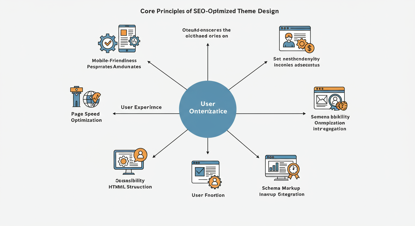
Building a theme with SEO in mind from the very beginning is crucial. It ensures that your website has a solid technical foundation, which is a key factor in how search engines rank your content. Here are the fundamental principles to follow. Learn more about 10 Best Responsive Website Themes.
Prioritize Mobile-First, Responsive Design
Mobile internet usage has long surpassed desktop browsing. In response, Google switched to mobile-first indexing, meaning it primarily uses the mobile version of a site for ranking and indexing. If your site isn’t optimized for mobile devices, your SEO will suffer significantly.
A responsive design automatically adjusts the layout and content to fit any screen size, from a large desktop monitor to a small smartphone. This approach guarantees a consistent and user-friendly experience across all devices.
How to implement it:
- Use a flexible grid: Build your layout on a fluid grid system that uses relative units like percentages instead of fixed pixels.
- Flexible images: Ensure images and other media resize within their containing elements.
- Media queries: Use CSS media queries to apply different styles based on the device’s characteristics, such as its width, height, or orientation.
- Test rigorously: Regularly test your theme on various real devices and emulators to ensure it functions flawlessly everywhere.
Write Clean, Semantic HTML

Clean, semantic HTML is the backbone of any SEO-friendly website. Search engine crawlers read your HTML to understand the structure and content of your pages. Using semantic tags like <header>, <nav>, <main>, <article>, and <footer> provides clear context about the different parts of your page.
Why it matters for SEO:
- Improved Crawlability: Semantic HTML makes it easier for search engine bots to navigate and understand your site’s hierarchy.
- Better Accessibility: It helps screen readers and other assistive technologies interpret your content, making your site more accessible to users with disabilities. This is a positive user experience signal for search engines.
- Future-Proofing: Code that adheres to web standards is more likely to be compatible with future browser updates and technologies.
A well-structured document also helps search engines identify key content, which can improve your chances of appearing in rich snippets.
Building for Scalability
A scalable theme can grow with your business. It should handle an increasing amount of content, traffic, and functionality without breaking or requiring a complete overhaul.
Create a Modular Codebase
A modular design approach involves breaking the theme down into smaller, reusable components. Instead of writing one monolithic stylesheet or JavaScript file, you create separate files for different elements like headers, buttons, forms, and navigation menus.
Benefits of modularity:
- Easier Maintenance: When you need to update a specific element, you only have to edit one small file instead of searching through a massive one.
- Reusability: Components can be easily reused across different templates and pages, ensuring consistency and saving development time.
- Improved Performance: By loading only the necessary CSS and JavaScript for a specific page, you can reduce load times.
Tools like Sass (for CSS) and modern JavaScript frameworks (like React or Vue) are built around this modular philosophy, making it easier to manage complex projects.
Design with Content Growth in Mind
As your website grows, you’ll add more pages, blog posts, products, and other types of content. A scalable theme anticipates this growth.
Key considerations:
- Flexible Navigation: Your main navigation should be able to accommodate new categories or pages without looking cluttered or breaking. Consider using mega menus for large sites.
- Dynamic Templates: Create flexible page templates that can handle varying amounts of content. For example, a blog post template should look just as good with a short 500-word article as it does with a 5,000-word guide.
- Pagination and Archives: Implement logical pagination and well-organized archive pages to help users and search engines navigate large amounts of content easily.
Optimizing for Page Speed
Page speed is a critical ranking factor for Google. A slow website leads to a high bounce rate and a poor user experience. Your theme design has a direct impact on how quickly your pages load.
Optimize Images
Large, unoptimized images are one of the most common culprits of slow websites.
Best practices for image optimization:
- Choose the right format: Use JPEGs for photographs and WebP or AVIF for a balance of quality and compression. Use PNGs for images with transparency and SVGs for logos and icons.
- Compress images: Use tools like TinyPNG or ImageOptim to compress images before uploading them, significantly reducing their file size without sacrificing quality.
- Implement lazy loading: Lazy loading defers the loading of off-screen images until the user scrolls down to them. This speeds up the initial page load.
Minify CSS, JavaScript, and HTML
Minification is the process of removing unnecessary characters (like whitespace, comments, and line breaks) from your code files. This reduces the file size, allowing them to be downloaded and parsed more quickly by the browser. Most build tools and many CMS plugins can automate this process.
Leverage Browser Caching
Browser caching stores static files—like your CSS, JavaScript, and images—on a user’s device. When they revisit your site, their browser can load these files from the local cache instead of re-downloading them from the server, resulting in much faster load times. You can configure caching rules in your server’s .htaccess file or through your hosting provider.
Advanced SEO Features for Your Theme
To give your website a competitive edge, incorporate advanced SEO features directly into your theme.
Implement Structured Data (Schema Markup)
Structured data is a standardized format for providing information about a page and classifying its content. For example, you can use schema markup to tell search engines that a page contains a recipe, an article, a product, or an event.
This helps search engines understand your content more deeply and can result in “rich snippets” in search results—like star ratings, prices, or cooking times. These enhanced listings are more eye-catching and can significantly improve your click-through rate. Use tools like Google’s Rich Results Test to validate your implementation.
Ensure Proper Heading and URL Structures
Your theme should enforce a logical heading structure on every page. There should be only one <h1> tag per page, which typically contains the main title. Subheadings should follow a clear hierarchy (<h2>, <h3>, etc.). This helps both users and search engines understand the document’s structure.
Furthermore, ensure that the theme generates clean, user-friendly URLs. URLs should be descriptive and include relevant keywords, rather than being a jumble of IDs and parameters.
Your Theme is Your Foundation
Designing a website theme is about creating a robust, flexible, and high-performing foundation for your digital presence. By prioritizing mobile-first design, clean code, page speed, and scalability from the outset, you build a theme that serves both your users and search engines effectively.
Integrating SEO principles directly into the development process is not an optional extra; it is a fundamental requirement for online success. A theme built on these principles will not only look professional and function smoothly but will also be equipped to climb the search rankings and adapt to the future growth of your business.
Meta data
Meta title
Guide to Scalable and SEO-Optimized Website Themes
Meta description
Learn how to design scalable, SEO-optimized website themes. Our guide covers mobile-first design, clean code, page speed, and structured data.


No Comments