
This guide breaks down the essential types of web design you need to know. You will explore various frameworks, discover actionable strategies to boost engagement, and learn how to select the perfect architecture to match your specific business goals and audience needs.
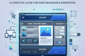
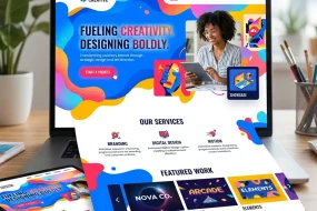
Creating a website requires more than just picking pretty colors. You must choose from various types of web design to ensure your site functions perfectly across all devices. We will explore the technical approaches, layout strategies, and user-centric frameworks that dominate the digital space.
Selecting the right foundation dictates how users interact with your content. When you understand the distinct types of web design available, you can align your visual strategy with your core business objectives, leading to better retention and higher conversion rates. Let us dive into the fundamental categories.
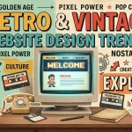
Static Website Layouts
Static websites represent one of the oldest and simplest types of web design. In a static layout, the server delivers pre-built HTML files directly to the user’s browser. The content remains fixed until a developer manually updates the source code.
This approach offers incredible speed and security. Since there is no database processing required, static pages load almost instantly. However, they lack interactivity. If you need to update content frequently, managing a static site becomes tedious and time-consuming. Small businesses, portfolio sites, and landing pages often benefit from this straightforward approach because it requires minimal server resources.
To improve your static site, focus on clean typography and high-quality imagery. Implement user interface best practices to ensure visitors can navigate easily without needing complex interactive elements.
Dynamic Website Frameworks
Dynamic sites contrast sharply with static ones. These types of web design rely on server-side scripting languages like PHP, Python, or Ruby to generate content in real-time. When a user requests a page, the server pulls information from a database and constructs the HTML on the fly.
This flexibility makes dynamic layouts ideal for content-heavy platforms. Blogs, news portals, and large corporate sites rely on dynamic frameworks to manage thousands of pages efficiently. You can easily update content through a Content Management System (CMS) without touching a single line of code.
While dynamic sites offer incredible power, they require more server resources and can face security vulnerabilities if not properly maintained. You should regularly update your plugins and core software to protect your database. Make sure to review our guide on website security protocols to keep your dynamic platform safe.
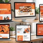
Responsive Frameworks

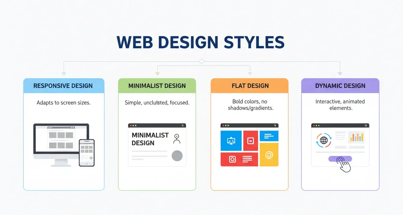
When discussing modern types of web design, responsive layouts dominate the conversation. A responsive web design automatically adjusts its layout, images, and typography to fit the screen size of the device accessing it. Whether a user visits on a desktop, tablet, or smartphone, the website provides an optimal viewing experience.
Responsive frameworks use fluid grids and CSS media queries. Instead of defining widths in absolute pixels, designers use percentages. This ensures elements scale proportionally. Search engines favor this approach because it maintains a single URL for all devices, preventing duplicate content issues and consolidating link equity.
Investing in responsive architecture is no longer optional; it is mandatory. Over half of all global web traffic comes from mobile devices. If your site fails to adapt smoothly, users will bounce, signaling to search engines that your page lacks value. Consult guidelines from Google Search Central to ensure your responsive framework meets performance standards.
Adaptive Layout Strategies
Many people confuse responsive and adaptive layouts, but they represent two different types of web design. While responsive sites fluidly change based on screen size, adaptive web design uses static layouts based on specific breakpoints.
When a browser loads an adaptive site, the server detects the device and delivers a layout specifically optimized for that screen size. Designers typically create distinct layouts for several common widths: 320px, 480px, 760px, 960px, 1200px, and 1600px.
This approach allows for highly tailored experiences. You can serve lower-resolution images to mobile users to improve load times, while delivering high-definition assets to desktop visitors. However, building and maintaining multiple layouts requires significantly more development time and resources compared to a single responsive grid.
Liquid (Fluid) Architectures
Liquid layouts, also known as fluid layouts, are among the more traditional types of web design that preceded modern responsive techniques. In a liquid design, elements use percentage-based widths instead of fixed pixels, similar to responsive grids. However, liquid layouts lack the CSS media queries that allow elements to stack or rearrange based on screen size.
The content simply stretches or shrinks to fill the available space. On a massive widescreen monitor, lines of text might stretch uncomfortably long, making reading difficult. On a small mobile screen, multiple columns might squish together, rendering the content unreadable.
While liquid layouts solve basic resizing issues, they fail to provide the structural control necessary for optimal readability across extreme screen dimensions. Most modern developers combine fluid principles with media queries to create true responsive experiences.
Single Page Applications (SPAs)
Single Page Applications (SPAs) represent one of the most innovative types of web design. Instead of loading entire new pages from the server when a user clicks a link, an SPA rewrites the current page dynamically. It uses JavaScript to fetch and render only the necessary data.
This creates a incredibly fast, app-like experience. Users navigate seamlessly without the jarring “flash” of a traditional page reload. Popular platforms like Gmail and web-based social media feeds rely heavily on SPA architecture to keep users engaged.
However, SPAs present unique challenges for search engine optimization. Since the content loads dynamically via JavaScript, search engine crawlers historically struggled to index it properly. While rendering capabilities have improved, you must implement server-side rendering or pre-rendering techniques to ensure search engines can properly crawl and index your SPA content. Focus heavily on optimizing your user experience to keep visitors engaged on the single interface.
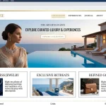
E-commerce Interfaces

Building an online store requires highly specialized types of web design. E-commerce web design focuses entirely on the buyer’s journey, from product discovery to secure checkout. The primary goal is to remove friction and facilitate transactions.
Effective e-commerce layouts prioritize clear product categorization, robust search functionality, and high-quality visual assets. You must design intuitive filtering systems so users can quickly find exactly what they want. Additionally, trust signals like secure payment badges, customer reviews, and clear return policies must feature prominently within the layout.
The checkout process demands particular attention. Implementing a streamlined, multi-step checkout with progress indicators reduces cart abandonment. Always provide a guest checkout option, as forcing users to create an account often drives them away. Read our comprehensive breakdown on maximizing e-commerce conversions for deeper insights into store optimization.
Minimalist Approaches
Minimalism is not just an aesthetic trend; it is a highly functional approach among the various types of web design. Minimalist layouts strip away all non-essential elements, focusing the user’s attention entirely on the core message or primary call to action.
This strategy relies heavily on negative space (white space), bold typography, and limited color palettes. By removing visual clutter, you reduce cognitive load, allowing users to process information faster and make decisions more easily.
Minimalist types of web design also boast significant performance benefits. Fewer elements mean fewer HTTP requests and smaller file sizes, resulting in blazing-fast load times. The Nielsen Norman Group frequently highlights how reducing visual noise directly correlates with improved usability and task completion rates.
Comparison Table: Choosing Your Layout
|
Framework Type |
Primary Benefit |
Best Use Case |
Development Cost |
|---|---|---|---|
|
Static |
Speed and security |
Portfolios, landing pages |
Low |
|
Dynamic |
Content management |
Blogs, news sites |
Medium |
|
Responsive |
Device flexibility |
Corporate sites, local business |
Medium to High |
|
Adaptive |
Tailored experiences |
Complex web apps |
High |
|
Single Page |
App-like speed |
Dashboards, SaaS products |
High |
Common Mistakes to Avoid
When implementing different types of web design, developers frequently stumble into avoidable traps. Keep these pitfalls in mind to protect your site’s integrity:
- Ignoring Mobile Users: Building a desktop-first site and attempting to squeeze it onto a mobile screen destroys usability. Always adopt a mobile-first mindset.
- Poor Contrast Ratios: Using light gray text on a white background strains the eyes. Ensure your color choices meet accessibility standards for contrast.
- Cluttered Navigation: Cramming every page into your primary menu overwhelms visitors. Use logical categorization and mega-menus if you have extensive content.
- Slow Load Times: Overloading your pages with uncompressed images and bloated scripts kills engagement. Optimize your assets relentlessly.
- Inconsistent Branding: Changing fonts, button styles, and colors across different pages confuses users and dilutes your brand identity.
Pro Tips and Expert Insights
To elevate your layouts above the competition, integrate these expert strategies into your workflow:
- Prioritize Accessibility: Ensure your chosen types of web design accommodate users with disabilities. Use proper heading structures, ARIA labels, and descriptive alt text for all images. Check the W3C Web Accessibility Initiative guidelines for comprehensive standards.
- Implement Micro-interactions: Small, subtle animations—like a button slightly changing color when hovered over—provide satisfying visual feedback and make the interface feel responsive and alive.
- Leverage Visual Hierarchy: Guide the user’s eye deliberately. Use size, color, and placement to indicate which elements are most important. Make your primary call to action impossible to miss.
- Test Relentlessly: Never assume your design works perfectly. Conduct A/B testing on different layouts, button placements, and copy to gather data-driven insights on user preferences.
- Map the User Journey: Before writing any code, sketch out exactly how you want a visitor to move through your site. Align your UI design choices with that intended path.
Conclusion
Understanding the various types of web design empowers you to build highly functional, visually appealing, and strategically sound digital platforms. Whether you opt for a lightning-fast static page, a content-rich dynamic site, or a fully adaptable responsive framework, prioritize the user’s needs above all else. Ready to transform your online presence? Start analyzing your audience data today and select the architecture that will drive your business forward.
FAQs
What are the main types of web design?
The main types of web design include static, dynamic, responsive, adaptive, liquid, and single-page applications. Each serves different structural purposes depending on content volume and user interaction requirements.
How does responsive design differ from adaptive design?
Responsive layouts fluidly adjust to any screen size using percentage-based grids, while adaptive layouts use distinct, fixed layouts created for specific screen breakpoints.
Which types of web design are best for SEO?
Responsive architectures are widely considered the best for SEO. They maintain a single URL across all devices, prevent duplicate content, and provide a consistent user experience that search engines favor.
Why should I avoid liquid layouts?
Liquid layouts stretch or compress content based purely on screen width without rearranging elements. This often leads to text lines that are too long on wide monitors or cramped columns on mobile devices, harming readability.
What is a Single Page Application (SPA)?
An SPA is a web application that loads a single HTML page and dynamically updates the content as the user interacts with the app, providing a fast, seamless experience without requiring full page reloads.
Are static websites still relevant?
Yes. Static sites are incredibly fast, secure, and cheap to host. They remain an excellent choice for simple landing pages, resumes, and small informational sites that do not require frequent content updates.
How do I choose the right design type for my business?
Evaluate your content volume, update frequency, target audience devices, and budget. If you run a blog, a dynamic CMS is essential. If you sell products, you need specialized e-commerce architecture.
What role does minimalism play in different types of web design?
Minimalism focuses on removing non-essential elements to reduce cognitive load and improve site speed. It can be applied across responsive, static, or dynamic frameworks to enhance overall usability.
How does mobile-first indexing impact my design choices?
Search engines predominantly use the mobile version of your content for indexing and ranking. Therefore, you must implement types of web design—like responsive frameworks—that prioritize flawless mobile experiences.
Can I combine different web design types?
Absolutely. Many modern websites use dynamic frameworks (like a CMS) paired with responsive front-end layouts and minimalist visual principles to create optimal, highly functional experiences.
I am a design enthusiast and theme developer, dedicated to creating beautiful, user-friendly website themes. Through ThemeOrbis.com, I shares tips, insights, and creative resources to help startups, bloggers, and businesses build stand-out websites.


No Comments