
This guide breaks down the core concepts behind popular web design aesthetics, from minimalism to neo-brutalism. You will learn how these visual frameworks influence user behavior, load speeds, and technical SEO. By the end, you will know exactly how to match a specific design language to your brand identity while avoiding common development pitfalls.
The visual layout of your digital presence dictates how visitors perceive your brand within seconds. Understanding different website design styles gives you the power to craft digital experiences that captivate users, communicate your message clearly, and drive conversions. We will explore the characteristics of various design approaches, examine how aesthetics impact search engine optimization, and provide actionable tips to help you select the perfect visual framework for your project.
How Different Website Design Styles Impact SEO and User Experience
Design goes far beyond pretty colors and neat typography. When you evaluate different website design styles, you must consider how each framework affects your site’s technical performance. Search engines prioritize sites that offer a seamless, accessible user experience. Complex layouts with heavy animations might look impressive, but they can slow down page load times and frustrate mobile users.
Good web design helps your site rank higher by making it more user-friendly. A clean, responsive design ensures your content remains accessible across all devices, which directly supports your technical SEO strategy. Furthermore, clear site navigation reduces bounce rates and encourages visitors to spend more time exploring your internal pages. This signals to search engines that your content holds value.
You must balance aesthetic appeal with functional performance. Choosing a style that relies heavily on massive image files or convoluted code structures can severely damage your search visibility. By prioritizing responsive frameworks and optimized assets, you create a foundation that serves both human visitors and search engine crawlers effectively.
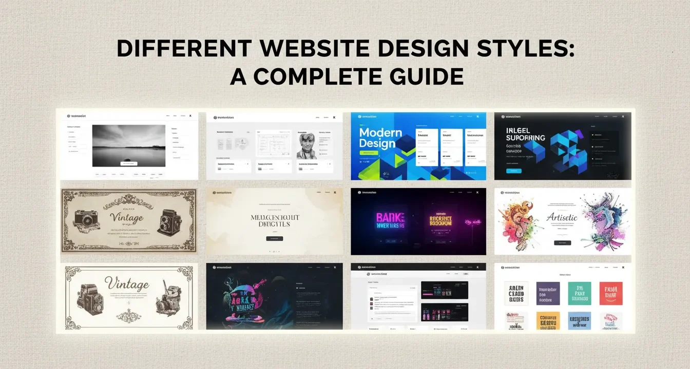
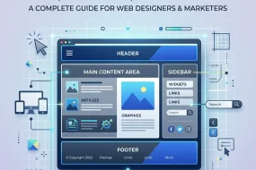
Core Website Design Styles Explained
Let us examine the most prominent design frameworks used by developers today. Each style carries distinct characteristics, advantages, and ideal use cases.
Minimalist Design
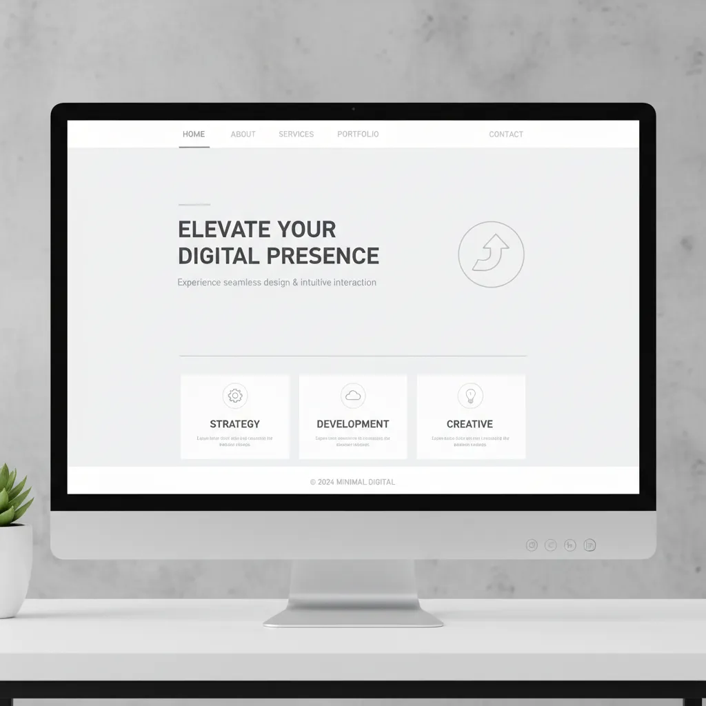
Minimalism focuses on the principle that less is more. This style strips away unnecessary elements, leaving only the essential components required for navigation and communication.
Characteristics:
- Abundant white space (negative space)
- Limited color palettes, often monochrome
- Simple, highly legible typography
- Hidden navigation menus (like the hamburger menu)
Applications:
Minimalism works perfectly for portfolio sites, luxury brands, and digital agencies. By removing visual clutter, you force the user to focus entirely on your core message or product. This style also benefits your site speed optimization, as fewer elements mean fewer HTTP requests and faster load times.
Flat Design
Flat design emerged as a reaction against skeuomorphism (designing digital elements to look like real-world objects). It embraces the two-dimensional nature of screens.
Characteristics:
- Lack of drop shadows, gradients, or textures
- Bright, contrasting colors
- Simple, vector-based illustrations and icons
- Grid-based layouts
Applications:
Tech companies and software-as-a-service (SaaS) platforms frequently use flat design. It scales beautifully across different screen sizes, making responsive design implementation straightforward. The reliance on CSS and SVG graphics rather than heavy raster images keeps the site lightweight and fast.
Material Design
Developed by Google, Material Design builds upon flat design by reintroducing subtle depth through lighting and shadows. It aims to mimic the physical properties of paper and ink.
Characteristics:
- Grid-based layouts with responsive animations
- Subtle use of light, surface, and movement
- Padding and depth effects (z-axis)
- Meaningful transitions
Applications:
This style suits mobile applications, digital dashboards, and platforms that require intuitive user interactions. The consistent visual language helps users understand hierarchies and interactive elements instantly.
Neumorphism (Soft UI)
Neumorphism blends minimalism with skeuomorphism. It creates elements that appear to be extruded from the background itself, creating a soft, plastic-like appearance.
Characteristics:
- Low contrast between elements and backgrounds
- Soft shadows and highlights to create depth
- Monochromatic color schemes
- Embossed or debossed button states
Applications:
While visually striking, neumorphism presents significant accessibility challenges due to its low contrast ratios. It works best for concept designs, simple utility apps, or specific internal dashboard elements where you can control the user environment.
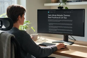
Dark Mode and High Contrast

Dark mode flips the traditional dark-text-on-light-background paradigm. It offers a sleek, modern aesthetic that reduces eye strain in low-light environments.
Characteristics:
- Deep black or dark gray backgrounds
- Bright, neon, or pastel accent colors
- High contrast typography
- Glowing effects and subtle gradients
Applications:
Entertainment platforms, developer tools, and gaming websites thrive on dark mode designs. You must ensure your contrast ratios meet accessibility standards, as dark mode can sometimes make small text difficult to read if not executed carefully.
Typography-Led Design
In this style, massive, bold text becomes the primary visual element, often replacing hero images or video backgrounds entirely.
Characteristics:
- Oversized, custom fonts
- Creative text alignments and wrapping
- Kinetic typography (moving text)
- Minimal supporting imagery
Applications:
Creative agencies, editorial platforms, and boutique brands use this to make strong, immediate statements. By relying on text rather than media, you can deliver a visually impactful experience that still loads incredibly fast, boosting your core web vitals.
Brutalism and Neo-Brutalism
Inspired by brutalist architecture, this style intentionally rejects conventional web design rules. It aims for a raw, unpolished, and sometimes jarring aesthetic. Neo-brutalism softens this slightly with modern color palettes and better usability.
Characteristics:
- Asymmetrical layouts
- Clashing colors and harsh outlines
- System fonts (Courier, Times New Roman)
- Visible structural elements (grids, borders)
Applications:
Streetwear brands, indie music labels, and avant-garde design portfolios use brutalism to stand out. It signals a departure from the corporate, polished look of the mainstream web.
Comparing the Frameworks
To help you understand how these approaches stack up against one another, review this structured comparison table.
|
Design Style |
Load Speed |
Accessibility |
Ideal Industry Fit |
Maintenance Level |
|---|---|---|---|---|
|
Minimalism |
Extremely Fast |
High |
Luxury, Portfolios |
Low |
|
Flat Design |
Fast |
High |
SaaS, Tech |
Low |
|
Material Design |
Moderate |
High |
Apps, Dashboards |
Medium |
|
Neumorphism |
Fast |
Low |
Concepts, Utilities |
High |
|
Dark Mode |
Fast |
Medium |
Gaming, Dev Tools |
Medium |
|
Brutalism |
Fast |
Varies |
Fashion, Arts |
Low |
Finding Inspiration from Top Design Blogs
When developing a new digital presence, studying industry leaders provides invaluable direction. You can gather remarkable insights by exploring resources like Awwwards, which showcases award-winning websites and digital projects. Platforms like this highlight how creative boundaries are constantly pushed, offering fresh ideas for typography, layout, and storytelling.
Similarly, reviewing specialized resources like Beaver Templates helps you understand how specific page builders and WordPress environments handle modern trends. Observing how templates incorporate different styles shows you practical, production-ready applications of abstract design concepts.
Analyzing these platforms also reveals how top designers manage the delicate balance between striking aesthetics and practical Grade My Website SEO principles. You will notice that the most successful sites never sacrifice clear navigation or fast load times for the sake of a flashy animation.
Common Mistakes to Avoid
Even experienced developers stumble when implementing new visual frameworks. Avoid these frequent errors to ensure your project succeeds.
- Sacrificing Usability for Aesthetics: Never let a beautiful layout obscure your navigation. If visitors cannot find your contact page or product catalog within seconds, they will leave.
- Ignoring Mobile Users: A design that looks stunning on a 27-inch monitor might become unusable on a smartphone. Always adopt a mobile-first approach. Ensure touch targets are large enough and text remains readable without zooming.
- Overloading with Animations: Movement catches the eye, but too much animation causes lag and confuses the user journey. Use animations purposefully to guide attention, not to show off technical skills.
- Poor Contrast Ratios: Light gray text on a white background looks sleek but fails basic accessibility standards. Ensure your color choices provide enough contrast for visually impaired users.
- Inconsistent Visual Language: Mixing flat icons with 3D buttons and brutalist typography creates a chaotic experience. Pick a style and stick to it across every page of your platform.
Pro Tips for Implementing Your Chosen Style
Follow these expert strategies to elevate your digital presence and ensure your chosen aesthetic delivers tangible business results.
- Optimize Your Assets: Regardless of the style you choose, compress all images and use modern formats like WebP. This preserves visual fidelity while drastically reducing file sizes.
- Establish a Design System: Document your chosen color palettes, typography scales, and component behaviors. A strict design system ensures consistency as your platform grows and new pages are added.
- Focus on Micro-Interactions: Small, subtle animations—like a button slightly changing color on hover or a smooth transition between pages—add massive polish to your site without impacting performance.
- Test on Real Devices: Emulators only tell half the story. Always test your designs on actual smartphones, tablets, and varied desktop monitors to ensure the experience holds up in the real world.
- Prioritize the Content Hierarchy: Your design should serve your content, not the other way around. Use size, color, and spacing to guide the user’s eye naturally down the page toward your primary call to action.
The Intersection of Aesthetics and Performance
Choosing a visual direction requires deep understanding of your target audience. A financial institution needs the trust and clarity conveyed by clean, material design, whereas an underground music venue can embrace the chaos of brutalism.
Every design decision you make carries a technical consequence. Heavy visual elements demand optimized delivery networks. Unique typography requires careful font loading strategies to prevent layout shifts. By bridging the gap between artistic vision and technical execution, you create platforms that delight users and satisfy search algorithms simultaneously.
Remember to routinely audit your platform. Trends evolve, and user expectations shift rapidly. What worked three years ago might look dated today. Continuous iteration keeps your brand relevant and your conversion rates high. Maintain a strong focus on your content marketing strategy alongside your visual updates to ensure your site remains a comprehensive resource for your audience.
Conclusion
Mastering different website design styles empowers you to build digital experiences that resonate with your target audience and perform brilliantly in search rankings. Whether you lean toward sleek minimalism or bold typography, your primary focus must remain on delivering a fast, accessible, and engaging user journey. Evaluate your current digital presence, select a framework that aligns with your brand identity, and start optimizing your layout for maximum impact today.
FAQs
What is the most popular website design style right now?
Minimalism and flat design remain highly popular due to their clean aesthetics and fast loading times. However, dark mode and typography-led designs are rapidly gaining traction for brands wanting to make bold, modern statements.
How do I choose the right design style for my business?
Analyze your target audience, industry standards, and brand identity. A law firm benefits from clean, traditional layouts that build trust, while a creative agency can take risks with brutalism or heavy animations to showcase their skills.
Do website design styles affect SEO?
Yes. Heavy designs with unoptimized images and complex code slow down page speed, which hurts rankings. A clean, responsive design improves user experience metrics like bounce rate and time on page, which search engines reward.
What is flat design?
Flat design is a minimalist approach that uses two-dimensional elements, bright colors, and simple typography. It avoids drop shadows, gradients, and textures that mimic real-world objects, making it highly scalable and fast-loading.
Is brutalist web design a good idea?
Brutalism works well for niche brands, artists, and fashion labels looking to stand out and reject corporate norms. It is not recommended for traditional businesses, e-commerce stores, or platforms that require high trust and straightforward usability.
What is the difference between UI and UX design?
User Interface (UI) design focuses on the visual elements—colors, typography, and button styles. User Experience (UX) design focuses on the overall feel, structural layout, and how easily a visitor can navigate and accomplish tasks on the site.
How does mobile-friendliness impact design choices?
Mobile-friendliness forces designers to prioritize essential content, use larger typography, and create touch-friendly navigation. Complex, wide layouts must be adapted into single-column structures that load quickly on cellular networks.
What are micro-interactions in web design?
Micro-interactions are subtle, functional animations that provide feedback to the user. Examples include a button changing color when hovered over, a loading spinner, or a checkmark animating when a form is successfully submitted.
Why is white space important in web design?
White space, or negative space, gives visual breathing room to your layout. It prevents cognitive overload, highlights important elements like calls-to-action, and makes typography much easier to read.
Can I mix different design styles together?
While you can borrow elements from different styles, mixing them heavily often leads to a confused, inconsistent user experience. It is best to establish a primary visual language and only introduce contrasting elements sparingly for emphasis.
I am a design enthusiast and theme developer, dedicated to creating beautiful, user-friendly website themes. Through ThemeOrbis.com, I shares tips, insights, and creative resources to help startups, bloggers, and businesses build stand-out websites.


No Comments