

In today’s digital landscape, a well-crafted online storefront is more than an aesthetic statement—it’s a strategic asset that drives sales and solidifies brand identity. Currently, businesses face fierce competition, making optimizing e-commerce website themes an essential initiative for any retailer aiming to boost revenue. This year (2026), consumer expectations have evolved, with shoppers demanding smooth navigation, clear product displays, and fast load times before they commit to a purchase. By focusing on detailed layout refinement, visual hierarchy, and trust-building elements, brands can create an environment that guides visitors naturally from discovery to checkout. In this comprehensive overview, we will explore how tailoring your website theme around user needs and data-driven insights can elevate conversion rates, reduce cart abandonment, and foster customer loyalty. Whether you are launching a new online store or refreshing an existing setup, the principles outlined here will help you craft a theme that resonates with your audience while supporting long-term growth. From understanding behavioral patterns to integrating performance optimizations, this article reveals actionable strategies for seamlessly aligning design and functionality. As you read on, you will find practical tips, industry best practices, and references to authoritative resources that demonstrate why optimizing e-commerce website themes remains a cornerstone of digital success in the current marketplace.
Understanding Your Audience and Theme Strategy
Any effort in optimizing e-commerce website themes must start with a clear picture of who your customers are and how they behave online. Today’s consumers are diverse in their preferences, motivations, and pain points. Some buyers might prioritize price and discounts, while others focus on product quality, brand reputation, or customer support options. Conducting in-depth research with tools like heatmaps, session recordings, and user surveys reveals common navigation paths, top-viewed items, and exit hotspots that hinder conversions. Platforms such as Google Analytics and built-in insights from leading e-commerce solutions help you identify critical drop-off points in the purchase funnel.
Developing customer personas based on demographic, psychographic, and behavior data enables you to tailor visual elements and content hierarchy that resonate with specific audience segments. When you integrate these personas into wireframing exercises, you can experiment with content placement, calls to action, and interactive features aligned with buyer expectations. For instance, a persona motivated by convenience may respond better to prominently displayed shipping information, whereas a value-driven persona might engage more with highlighted discounts and bundles.
Qualitative feedback is equally important. By surveying actual shoppers about imagery preferences, product description clarity, and desired support channels, you gather nuanced insights that guide design decisions. A/B tests on landing pages or product galleries will confirm which layout variations yield higher engagement and add-to-cart rates. Combining quantitative analytics with customer interviews lays a solid foundation for a theme that speaks directly to user needs.
As you map out your theme strategy, consider the broader context of your market category. A fashion retailer may emphasize high-resolution lookbooks and editorial-style layouts, while a B2B supplier might focus on technical specifications and user reviews. This contextual awareness ensures your theme not only looks appealing but also supports streamlined decision-making, reducing friction during the checkout process.
Once your initial theme blueprints are ready, simulate real-world browsing scenarios on multiple devices and network speeds. This validation step uncovers potential usability issues before any code is deployed. By iterating on prototypes early, you save time and resources compared to post-launch revisions. Ultimately, dedicating time to thorough audience understanding empowers you to implement design choices that enhance clarity, boost engagement, and drive conversions.
Putting audience insights at the heart of your design process is the first major milestone in optimizing e-commerce website themes effectively. With a data-informed strategy in place, you set the stage for the subsequent steps of layout design, visual refinement, performance tuning, and continuous testing, all of which will be covered in the following sections.
Designing User-Centric Layouts and Visual Hierarchy

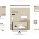
A thoughtfully organized layout is crucial when optimizing e-commerce website themes for maximum conversions. In today’s digital marketplace, shoppers expect intuitive navigation and clear pathways to product discovery. Begin by organizing your site around a logical grid system that adapts seamlessly to all screen sizes, from smartphones to large desktop monitors. Grids create consistent spacing and alignment, guiding users’ eyes along predictable routes as they explore product categories and offerings.
Whitespace plays a vital role in highlighting key content. By strategically increasing the spacing around important elements—such as product images, promotional banners, and primary navigation links—you draw visitor attention to areas that matter most. Whitespace also prevents visual overload, ensuring that each section of your page feels inviting and easy to scan. Consistent padding and margins reinforce brand trust by demonstrating attention to detail in design.
Effective visual hierarchy relies on variations in size, weight, and color. Larger, bold headlines establish clear sections and help users understand page structure quickly. Subheadings break up dense blocks of text, making product descriptions more digestible. Implementing contrasting accent colors on call-to-action buttons helps them stand out against background elements, increasing click-through rates. Ensure these accent colors align with your overall brand palette for a cohesive look.
Navigation placement is equally significant. While traditional top navigation remains familiar and accessible, you may also incorporate sticky headers or sidebars that follow users as they scroll. This approach reduces the time it takes for shoppers to find popular categories or return to key pages without excessive scrolling. Group related items under dropdown menus or mega-menus, using clear labels that match customer terminology to avoid confusion.
Visual separators such as thin lines, background shading, or subtle drop shadows can delineate content areas without cluttering the interface. For instance, a lightly shaded banner might highlight seasonal offers, while a thin border can isolate customer reviews or social proof widgets. These small design cues contribute to a polished, professional feel.
Moreover, be mindful of accessibility considerations when structuring layouts. Ensure sufficient color contrast between text and background, and verify that all interactive elements are reachable via keyboard navigation. This dual focus on design and inclusivity amplifies reach, allowing you to attract a wider audience and comply with relevant accessibility standards. When you combine visual hierarchy principles with a user-centric layout, you create a foundation that supports streamlined browsing, reduces decision fatigue, and drives more sales.
Crafting Engaging Visual Elements: Color, Typography, and Calls to Action
In the quest for optimizing e-commerce website themes, visual elements like color palettes and typography set the emotional tone that influences purchase decisions. Choose a primary color scheme that reflects your brand’s core identity and evokes the desired emotional response—trust, excitement, or sophistication. Today, many successful retailers employ accent colors strategically to highlight buttons, sale tags, and special offers, ensuring these focal points capture visitor attention immediately upon page load.
Typography complements color selection by organizing text in a hierarchy that guides the reader smoothly. Select no more than two or three complementary typefaces to prevent visual clutter. Large, bold fonts work well for headings and promotional banners, while medium-weight fonts for subheadings maintain readability. Body copy should use comfortable serif or sans-serif fonts at appropriate line spacing, ensuring long passages remain accessible on screens of all sizes.
Call-to-action buttons represent the critical juncture between browsing and buying. When designing CTAs, use action-oriented language that sets clear expectations—phrases like “Shop Now,” “Add to Cart,” or “View Collection” efficiently communicate the next step. Place these buttons in predictable locations: adjacent to product images, near descriptive text, and within fixed shopping cart sidebars. Consistency in shape, padding, corner radius, and hover effects reinforces their interactive nature.
Color contrast between CTA buttons and their surroundings is essential. A vibrant accent hue that contrasts with the background—for example, a bright orange or vivid green—will stand out against more neutral page areas. Combine this visual prominence with concise value propositions, such as “Free Shipping Over $50” or “Limited Stock Available,” to prompt immediate action. Avoid overwhelming visitors with multiple competing CTAs; instead, prioritize the most valuable conversion goal for each page.
In addition to static design, consider micro-interactions that provide subtle feedback on user actions. A gentle button animation or color change on hover signals interactivity and enriches the experience. While these effects should remain lightweight to prevent performance degradation, they add a layer of polish that communicates brand attentiveness to detail.
Finally, conduct regular testing of design variations to optimize visual impact. A/B testing different color combinations, typography scales, or CTA wording can reveal preferences unique to your audience. By systematically iterating on these visual components, you align your theme more closely with customer expectations, reducing friction in the buying process and maximizing conversion potential.
Enhancing Performance and Mobile-First Experience

Fast-loading pages and seamless mobile interactions are prerequisites when optimizing e-commerce website themes in today’s landscape. Research shows that even a one-second delay in page rendering can reduce conversions by up to 7%. To mitigate this risk, adopt a mobile-first design philosophy. Start by crafting base styles optimized for the smallest viewports, then progressively enhance layouts for larger screens. This approach ensures core functionality and content load quickly, regardless of device.
Implement responsive images with srcset attributes or adaptive delivery to serve appropriately sized assets. Lazy-loading off-screen media further accelerates initial rendering by deferring large images or videos until they enter the viewport. Combine and minify CSS and JavaScript files to reduce HTTP requests, and leverage critical CSS to render above-the-fold content immediately. Defer nonessential scripts and inline small style declarations to improve first paint times.
Content delivery networks (CDNs) play a pivotal role in distributing static assets closer to end users, minimizing latency and improving download speeds. Enable browser caching and use GZIP or Brotli compression to shrink file sizes during transfer. Regularly audit your theme with performance tools such as Google Web Fundamentals Lighthouse or WebPageTest to identify bottlenecks like render-blocking scripts or slow third-party calls.
On mobile devices, ensure interactive elements meet touch target guidelines—buttons and links should be at least 44 pixels high to prevent mis-taps. Avoid overcrowding the interface; prioritize critical elements and collapse secondary options behind clear expandable controls. Font sizes should be legible on small screens without requiring zoom, and line lengths must stay within comfortable reading ranges.
Progressive Web App (PWA) features, such as service workers and offline caching, can further elevate user experience by reducing perceived load times and enabling basic functionality even when connectivity is poor. Implementing tech like native browser caching and background synchronization can boost reliability, a key factor in retaining customers. By treating performance as an integral part of theme design, rather than an afterthought, you reinforce the importance of speed in driving higher engagement and conversions.
Ultimately, prioritizing performance and a mobile-first mindset ensures that your optimized e-commerce website themes deliver consistent, reliable experiences across diverse devices and network conditions. This technical foundation supports all other design and marketing efforts, laying the groundwork for sustained growth.
Building Trust, Accessibility, and SEO Integration
Trust signals and discoverability go hand in hand when optimizing e-commerce website themes. Today’s shoppers demand confidence in site security, transparency in policies, and evidence of product quality before they finalize purchases. Incorporate trust badges—such as SSL certificate icons or recognized payment provider logos—in the header or footer to reassure visitors that their data is safe. Customer reviews with star ratings, user-generated photos, and case studies act as social proof, increasing perceived credibility. Strategically place these elements near product details to support decision-making.
Accessibility is not only a legal requirement but also an SEO opportunity. Following guidelines from the Web Content Accessibility Guidelines (WCAG), ensure all images include descriptive alt text, interactive components are keyboard-navigable, and color contrasts meet minimum ratios. Semantic HTML tags—<header>, <nav>, <main>, <footer>—deliver meaningful structure that assistive technologies and search engines can interpret. A theme built with accessibility in mind expands your potential audience and strengthens search visibility.
Search engine optimization starts with a clear URL structure and descriptive meta tags. Use human-readable paths that reflect product hierarchies—for example, /women/shoes/running—and craft title tags within 50–60 characters, including your focus keyword: optimizing e-commerce website themes. Meta descriptions should summarize the page in up to 155 characters, enticing clicks from search results.
Embedding structured data using schema markup for products, reviews, and breadcrumbs enhances search listings with rich snippets, improving click-through rates. Keep markup up to date, reflecting current pricing, availability, and ratings. Regularly monitor search console reports to detect crawl errors or indexing issues. Page speed remains an SEO factor, so continuous performance tuning—outlined in previous sections—benefits organic rankings.
Security and policy transparency further elevate trust. Display clear return policies, shipping timelines, and customer service contacts in accessible locations. Offer multiple communication channels—live chat, email, or phone—to address concerns promptly. When visitors feel supported and informed, they are more likely to commit to transactions and return for future purchases.
By uniting trust-building elements, robust accessibility practices, and SEO best practices into your theme architecture, you create a durable framework that drives qualified traffic and fosters long-term loyalty. In today’s competitive marketplace, this holistic approach is vital for sustained performance and growth.
Frequently Asked Questions
How can I determine which design elements resonate most with my audience?
Conduct A/B tests on landing pages, utilize heatmaps and session recordings, and gather direct feedback through surveys and interviews. Analyzing quantitative metrics alongside qualitative insights reveals which layouts, colors, and calls to action your customers prefer.
What are the key performance metrics to monitor after theme optimization?
Track page load times (First Contentful Paint, Largest Contentful Paint), conversion rate, bounce rate, and average session duration. Regularly auditing these KPIs with tools like Lighthouse and Google Analytics ensures your theme maintains optimal speed and engagement.
How often should I update or refresh my e-commerce theme?
Major theme refreshes are typically recommended every 12–18 months to incorporate new features, design trends, and performance enhancements. However, continuous small updates—driven by data insights, seasonal promotions, or user feedback—help maintain peak effectiveness.
Conclusion
Optimizing e-commerce website themes is a multifaceted journey that touches every aspect of online retail—from understanding buyer motivations to ensuring fast, secure, and accessible experiences. In today’s digital landscape, dedicating resources to refining layout structures, visual elements, and performance optimizations yields measurable gains in conversion rates and customer satisfaction. Continuous research, testing, and iteration keep your theme aligned with evolving user expectations, while trust signals and SEO integration expand your brand’s reach and credibility. By applying the strategies outlined above and leveraging authoritative resources, you position your store for success in this year (2026). Embrace a data-driven mindset, prioritize inclusivity, and remain adaptable as new technologies and consumer behaviors emerge. Investing in robust analytics and experimentation frameworks ensures that your theme continues to perform at its peak, adapting to seasonal demands and emerging trends. Remember, optimizing e-commerce website themes is not a one-off project but an ongoing commitment to delivering exceptional shopping experiences. Begin implementing these insights now, and you will reap the rewards of a conversion-focused theme that drives long-term profitability and brand differentiation.


No Comments