
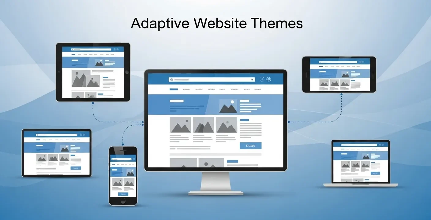
Adaptive website themes deliver device-specific layouts to improve performance, speed, and user experience. They enhance usability and SEO but require more development effort compared to flexible responsive design approaches.
In today’s digital landscape, visitors expect more than just a functional website—they seek tailored experiences that evolve based on their actions and preferences. Generic layouts and static interfaces no longer capture attention or foster loyalty. As businesses strive to stand out in a crowded online marketplace, the concept of adaptive website themes has emerged as a powerful solution to deliver personalized journeys that resonate with each user. By harnessing real-time data and dynamic rendering techniques, organizations can present the most relevant content, layouts, and design elements that reflect individual visitor profiles.
With rapidly changing user behaviors and device innovations unfolding this year, implementing adaptive website themes enables brands to stay agile, improve engagement, and increase conversion rates. This comprehensive guide explores the foundational principles behind adaptive approaches, outlines best practices for data collection and ethical personalization, highlights essential design systems and tools, and provides a step-by-step framework for rolling out your own adaptive theme. Whether you are a marketer, designer, or developer, you will discover practical insights to craft a website experience that feels intuitive, relevant, and memorable—ensuring your brand truly connects with its audience today.
What Are Adaptive Website Themes?
Adaptive website themes represent an evolution beyond standard responsive design by tailoring not just a site’s appearance but the actual content and interface to match the visitor’s context. Whereas a responsive layout rearranges elements to fit screen sizes, an adaptive theme dynamically swaps imagery, modifies typography scales, or reorders navigation links according to data points such as device type, geographic location, time of day, or past interactions.
At the core of adaptive design is the ability to sense user context in real time. By integrating client-side and server-side logic, a website can detect signals—like referral sources, browsing history, or device capabilities—and apply variant rules that adjust page modules on the fly. This process elevates personalization by ensuring each segment of your audience encounters the most relevant content blocks, promotional banners, or call-to-action buttons tailored to their needs.
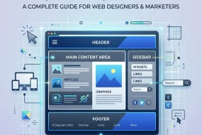
Key attributes of adaptive website themes include context awareness, behavioral personalization, dynamic layout adjustments, and modular architecture. Context awareness enables the theme to respond to external factors such as screen resolution or network speed. Behavioral personalization harnesses user actions—click patterns, scroll depth, and form submissions—to refine on-site messaging. Dynamic layout capabilities swap or reorder sections to optimize conversion paths. Finally, a modular structure relies on reusable components, often governed by design tokens or UI libraries, making it easy to orchestrate variant combinations without duplicating code.
Context Awareness and Behavioral Signals
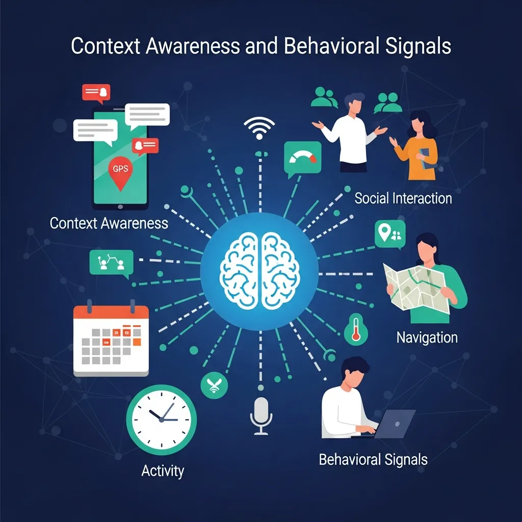
Detecting visitor context starts with simple metrics like device category and operating system, but can extend to richer datasets such as time zone, language preferences, and referral channels. Pairing these inputs with behavioral data—mouse movements, session recordings, and purchase history—enables granular personalization rules that speak directly to each user segment.
Why Personalized Experiences Matter
In today’s competitive arena, personalization has proven to drive key performance indicators across industries. Consumers now expect brands to anticipate their needs and recommend relevant products or content without extensive searching. When a site feels intuitive and aligned with personal interests, users engage longer, explore deeper, and exhibit stronger brand loyalty. Research indicates that personalized web experiences can reduce bounce rates by up to 20% and increase conversion rates by nearly 15%, underscoring the business impact of adaptive website themes. Rather than broadcasting generic promotions, adaptive themes serve targeted offers and customized messaging that mirror user intent—whether they are first-time visitors, loyal returners, or high-value customers. This targeted approach not only boosts sales and sign-ups but also fosters trust as visitors perceive your brand as attentive and responsive.
Another advantage of personalized UX is improved brand recall. Consistency in voice and design across variants supports a cohesive identity, while tailored interactions reinforce relevance. As customer expectations evolve, delivering adaptive experiences positions your organization at the forefront of innovation, giving you a competitive edge in attracting and retaining audiences.
Key Benefits of Adaptive Personalization
- Increased Engagement: Relevant content resonates better and encourages deeper exploration.
- Higher Conversion Rates: Offers and calls-to-action that reflect user intent drive immediate responses.
- Stronger Loyalty: Consistent, personalized experiences foster long-term relationships and advocacy.
- Market Differentiation: Adaptive website themes remain rare—adopting them early sets you apart.
Collecting and Applying User Data Responsibly
Adaptive website themes rely heavily on accurate, ethically sourced data. Before rolling out personalization logic, you must establish robust processes for gathering, structuring, and applying user insights in compliance with privacy regulations. This year, regulatory bodies continue to emphasize transparency and user control, making adherence to standards like GDPR and CCPA nonnegotiable.
Start by integrating analytics platforms such as Google Analytics or a privacy-focused alternative like Matomo to capture essential metrics: page views, session durations, device types, and referral paths. Complement this with behavioral tracking tools—heatmaps and session recordings—to identify high-interest areas and friction points. Align CRM or CDP data for authenticated users, ensuring purchase history and demographic details inform your personalization rules.
Geolocation and contextual signals further enhance relevance by tailoring currency formats, language settings, and localized promotions. You can also deploy brief on-site surveys or preference center widgets to collect explicit user inputs for refining variant logic. Throughout, anonymize sensitive data and obtain clear user consent, offering straightforward opt-out options.
Adhering to Data Security Best Practices
Ensuring data security and privacy protection is paramount when handling personalized experiences. National standards outlined by organizations like NIST offer guidance on securing data pipelines and storage. For detailed recommendations, refer to the National Institute of Standards and Technology’s publications on access control and encryption protocols.
Essential Design Systems and Tools
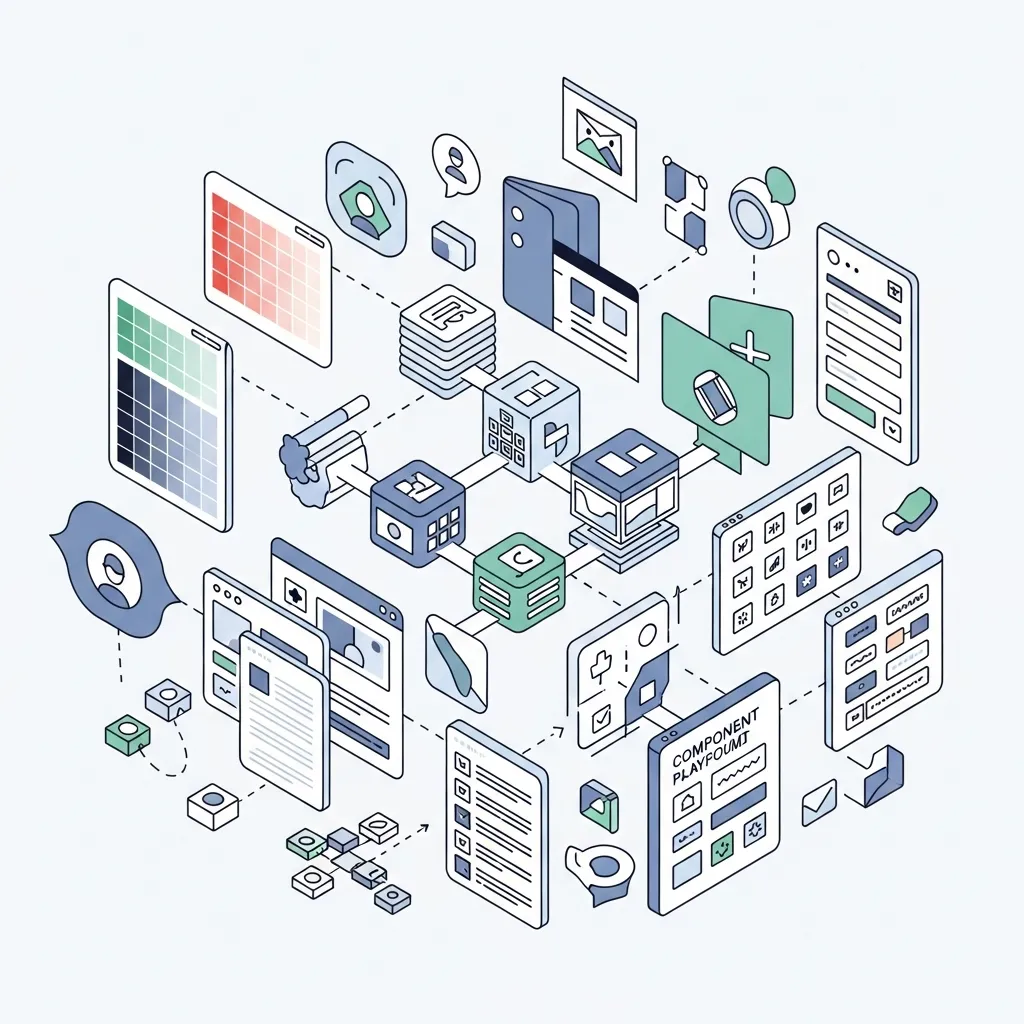
Implementing adaptive website themes demands a solid design system and a versatile toolset. A well-structured design system incorporates design tokens for consistent colors, typography scales, spacing units, and shadow styles. Tools like Style Dictionary streamline token management across multiple platforms, ensuring uniform visual language in every variant.
Component libraries built on frameworks such as React, Vue, or web components provide the building blocks for dynamic interfaces. Each component should accept configuration props or attributes to toggle between different variants—whether swapping hero images, adjusting button styles, or modifying grid layouts. For complex state management, integrate solutions like Redux, Vuex, or the Context API to store and retrieve user preferences and variant flags efficiently.
To control the release and testing of different variants, feature flag services and A/B testing platforms are indispensable. Tools such as LaunchDarkly, Optimizely, and VWO facilitate safe experimentation, enabling you to measure the impact of each adaptive variation before rolling it out broadly. Additionally, leveraging a headless CMS—for example, Contentful or Strapi—grants marketing teams the autonomy to update modular content blocks without requiring developer intervention.
Accessibility and Validation Standards
Ensuring that adaptive variants remain accessible is crucial. Follow the Web Accessibility Initiative’s guidelines for color contrast, keyboard navigation, and semantic markup. By adhering to these standards, you deliver inclusive experiences that comply with legal requirements and reach a wider audience.
Implementing Your Adaptive Theme Strategy

Bringing an adaptive theme to life involves coordinating front-end code, back-end services, and data pipelines. Begin by defining clear user segments—whether new vs. returning visitors, device categories, geographic regions, or behavioral cohorts—using insights from your analytics stack.
Next, map out UI variants for each segment, documenting exactly which components will change. Create a variant matrix that covers hero banners, navigation structures, call-to-action text, and theme color palettes. Then, develop modular components that accept variant parameters. Employ CSS custom properties or runtime theming libraries to switch between styles seamlessly.
At the core of your personalization engine, integrate a decision-making service—this can be a custom microservice or a third-party solution—that evaluates incoming user data and returns the appropriate variant flags. Ensure that asset delivery is optimized by inlining critical CSS, leveraging a CDN for image delivery, and lazy-loading non-essential scripts to maintain performance.
Monitoring, Testing, and Iteration
Once your adaptive theme is live, continuously monitor key engagement and performance metrics. Track real-user measurement data like largest contentful paint (LCP) and first input delay (FID) to detect regressions. Run ongoing A/B tests to validate which variants drive the best results, and iterate swiftly based on the data. Automate the rollout of winning configurations to maximize impact.
Conclusion
Adaptive website themes are reshaping how organizations engage visitors by delivering deeply personalized, context-aware experiences. In today’s digital landscape, adopting these techniques can lead to higher engagement, improved conversions, and stronger brand loyalty. By collecting and applying data ethically, building a robust design system, and following a clear implementation roadmap, you can craft adaptive experiences that feel effortless and relevant for every segment. Stay committed to performance optimization, accessibility compliance, and ongoing experimentation to keep your site ahead of the curve. Today, the path to dynamic personalization starts with a small set of high-impact user segments—expand gradually, measure rigorously, and let your website evolve alongside the needs and behaviors of your audience this year.
Frequently Asked Questions
What are adaptive website themes?
Adaptive website themes are designs that adjust the layout and content based on specific device types like mobile, tablet, or desktop to ensure a better user experience.
How are adaptive website themes different from responsive design?
Adaptive themes use fixed layouts for different screen sizes, while responsive design fluidly adjusts to any screen. Adaptive themes load specific versions for each device.
Why are adaptive website themes important?
They improve performance, enhance user experience, and ensure websites look and function properly across different devices, increasing engagement and usability.
Are adaptive website themes good for SEO?
Yes, they can improve SEO by enhancing page speed, mobile usability, and user experience, which are important ranking factors for search engines.
How do adaptive website themes improve user experience?
They provide optimized layouts for each device, making navigation easier, improving readability, and ensuring faster loading times.
What devices support adaptive website themes?
They typically support desktops, tablets, and smartphones by serving customized layouts for each device type.
Are adaptive website themes mobile-friendly?
Yes, they are specifically designed to offer mobile-friendly versions of websites with optimized layouts and faster performance.
Do adaptive website themes load faster?
Yes, they often load faster because only the required layout and assets for a specific device are delivered.
What are the disadvantages of adaptive website themes?
They require more development effort, maintenance for multiple layouts, and may not support all screen sizes as smoothly as responsive designs.
Can adaptive website themes work with CMS platforms?
Yes, many CMS platforms like WordPress support adaptive themes through plugins or custom theme development.
Are adaptive website themes customizable?
Yes, developers can customize layouts, styles, and features for each device type to meet specific design needs.
Which is better: adaptive or responsive themes?
It depends on the project. Adaptive themes offer optimized control for specific devices, while responsive themes provide flexibility across all screen sizes.
Do adaptive themes affect website speed?
Yes, positively. They reduce unnecessary loading of elements, improving speed for targeted devices.
Are adaptive website themes expensive to build?
They can be more expensive than responsive designs because they require multiple layouts and additional development work.
What is the future of adaptive website themes?
The future includes smarter device detection, AI-based layout adjustments, and improved performance optimization for a seamless user experience across all platforms.
Mary McElwee is an editor at ThemeOrbis, specializing in creating and refining content around WordPress themes, web design, and digital creativity. She simplifies complex design and development concepts into clear, practical insights that help users build modern, responsive, and high-performing websites with ease.


No Comments