

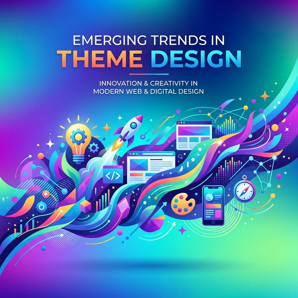
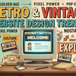
Emerging Trends in Theme Design
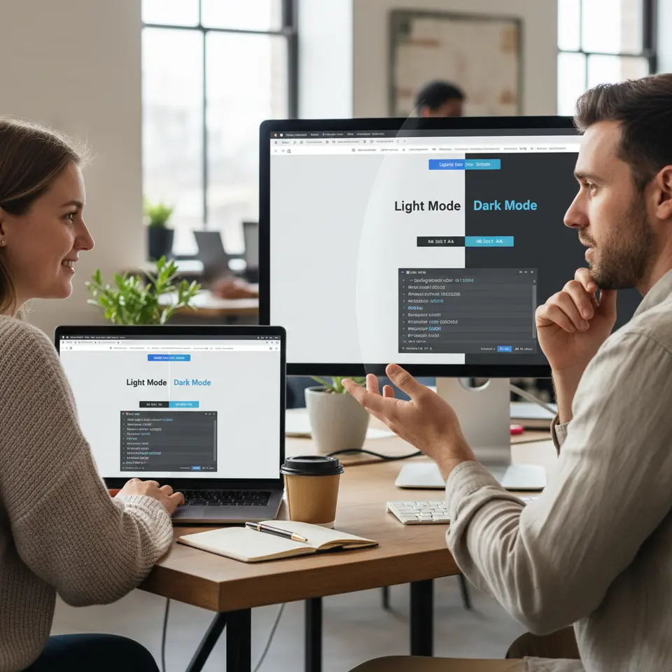
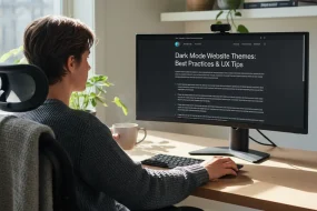
Dark Mode and System-Level Preferences
Dark interfaces have transcended mere aesthetics and become a usability expectation for many. Modern operating systems offer native light and dark schemes, and your theme can automatically detect these preferences using the CSS prefers-color-scheme media feature. By defining a set of CSS custom properties for both palettes—such as --background-color, --text-color, and --accent-color—you ensure seamless transitions and a cohesive look across components. Dark mode not only reduces eye strain in low-light conditions but can also improve battery life on OLED screens. When building next-generation website themes, plan your color tokens and contrast ratios carefully to maintain accessibility.
Interactive Micro-Animations
Subtle motion cues can guide attention, highlight interactive elements, and reinforce brand identity without bogging down performance. Techniques like CSS transitions, transforms, and the Intersection Observer API enable hardware-accelerated animations that remain smooth even on mobile devices. Consider micro-interactions such as button hover effects, pull-to-refresh indicators, and progress spinners. When implemented judiciously, these details add delight and reinforce feedback loops. Today, frameworks like Framer Motion for React or the Web Animations API make it easier than ever to orchestrate fine-grained animations within your theme.
AI-Powered Personalization
Intelligent themes tailor content and layout based on user signals such as browsing history, geolocation, or device type. By integrating machine learning services or headless CMS intelligence, you can dynamically swap banners, adjust font scales, or recommend related articles in real time. This level of customization fosters deeper engagement and higher conversion rates. In today’s competitive environment, AI-driven personalization transforms static templates into living experiences that resonate individually with each visitor.
Voice-Centric Navigation
With voice assistants gaining mainstream adoption, designing themes that support spoken commands enhances accessibility and convenience. Implement semantic HTML5 landmarks—<nav>, <main>, and <footer>—and ensure interactive elements include ARIA labels. Such practices enable screen readers and voice-enabled devices to parse your layout effectively. In 2026, embedding voice search widgets or voice-triggered menus can differentiate your theme and reach a wider audience.
Augmented Reality and Virtual Reality
Immersive experiences once reserved for stand-alone applications are now possible within a browser. WebXR and libraries like three.js empower themes to host 3D product showcases, 360° panoramas, and interactive simulations. While still an emerging niche, AR/VR modules can provide unforgettable demos, especially for sectors like real estate, education, and retail. Carefully balance performance budgets to ensure these features load smoothly alongside your core design assets.
Minimalism, Neumorphism, and Glassmorphism
Visual styles continue to evolve toward simplicity and depth. Minimalism emphasizes white space and clear typography to let content shine. Neumorphism introduces subtle shadows and highlights for a soft, tactile feel. Glassmorphism adds transparency, blur, and layered panels for a frosted-glass effect. When used sparingly and with attention to color contrast, these approaches can elevate aesthetics without sacrificing usability. The key is to blend contemporary flair with practical clarity in your next-generation website themes.
Cutting-Edge Tools for Building Themes

Design Tokens and Centralized Style Systems
Maintaining consistency across multiple projects requires a single source of truth for design values. Design tokens are named variables for colors, spacing, typography, and shadows. Tools like Theo or Style Dictionary automate token export to CSS, JavaScript, or mobile platforms. In Figma, plugins such as Figma Tokens let designers and developers stay in sync. By driving your theme from token libraries, you ensure unified styling and faster iterations.
Modern Styling Frameworks and CSS-in-JS
CSS-in-JS libraries like Emotion and styled-components encapsulate styles at the component level, preventing global namespace collisions. Alternatively, utility-first frameworks such as Tailwind CSS provide rapid prototyping with low-level utility classes. Choose a strategy aligned with your team’s expertise and performance goals. When bundling your theme, apply tree shaking and PurgeCSS to strip unused rules and shrink file sizes.
Component Libraries and Live Documentation
Prebuilt component suites—Material-UI, Ant Design, or Chakra UI—offer solid foundations you can customize through theme tokens. Storybook serves as an interactive playground, letting teams develop and test components in isolation. Document usage patterns, edge cases, and prop configurations to simplify onboarding and reduce styling regressions. Continuous visual regression testing within Storybook can alert you to unintended CSS changes.
Headless Content Management Systems
Decoupling content from presentation via headless CMS platforms—such as Contentful or Strapi—gives designers freedom to iterate on themes independently. Fetch data through GraphQL or REST endpoints and map responses to your component API. This separation accelerates updates, supports omnichannel delivery, and improves editorial workflows.
Performance Auditing Platforms
Stay on top of loading speeds and user experience metrics with tools like web.dev/measure, Google Lighthouse, and WebPageTest. Embed performance budgets in your CI/CD pipeline to block regressions. Real User Monitoring (RUM) solutions can surface real-world bottlenecks, guiding optimizations for your next-generation website themes.
Optimizing for Speed and Accessibility
Streamlining the Critical Rendering Path
Minimizing render-blocking resources accelerates First Contentful Paint (FCP). Inline the most essential CSS for above-the-fold content and defer noncritical styles. Load web fonts asynchronously and consider using font-display: swap to avoid invisible text. Leverage code splitting and dynamic imports to prioritize initial payloads.
Accessibility Best Practices
Inclusive design is nonnegotiable. Adhere to standards like WCAG 2.1 guidelines to ensure sufficient color contrast, keyboard navigability, and semantic markup. Test with screen readers and automated tools such as aXe or Pa11y to identify edge-case issues. Accessibility improves usability for all and may satisfy legal requirements.
SEO-Friendly Semantic Markup
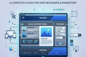
Optimize discoverability by using proper HTML5 structural elements—<header>, <nav>, <main>, <article>, and <footer>. Implement schema.org structured data, Open Graph meta tags, and Twitter Cards for rich previews on social platforms. Maintain a logical heading hierarchy and craft concise title tags and meta descriptions.
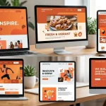
Mobile-First Responsive Layouts
Adopt a mobile-first mindset with fluid grids, flexible images, and media queries. Prioritize touch-friendly controls and test across real devices and emulators. In today’s multi-device environment, responsive themes adapt effortlessly from smartphones to large-format displays.
Modular Architecture and Maintainability
Break your theme into atomic components—buttons, cards, form fields—each with its own folder and style definitions. Clearly separate presentational elements from data-fetching logic. Document your theme API and style variables to accelerate collaboration and future updates.
Continuous Integration for Reliability
Integrate linting tools (ESLint, Stylelint), unit tests (Jest), and visual regression checks into your CI pipeline. Automate deployments with platforms like Netlify or Vercel to ensure rapid, consistent releases. A robust CI/CD workflow keeps your next-generation website themes stable and secure.
Collaborative Workflow Strategies
Design to Prototype with Tokens
Kick off projects by creating wireframes and style guides in tools like Figma or Sketch. Extract design tokens—colors, typography, spacing—using plugins such as Figma Tokens. This unifies design intent with code implementation and reduces translation errors.
Bridging Design and Development
Host token exports in a shared repository or package manager. Developers import these tokens directly into CSS-in-JS or utility framework configurations, ensuring parity with designers’ vision. Regular design–dev syncs help address discrepancies early.
Building and Testing Components
Develop UI elements in isolation using Storybook or Docz. Document variations, responsive behaviors, and accessibility considerations. Incorporate unit tests and snapshot tests to guard against style drift.
Dynamic Content Integration
Connect your components to a headless CMS, mapping fields such as images, rich text, and metadata. Test mock and real data scenarios to validate edge cases like empty states or exceptionally long copy.
Quality Assurance and Monitoring
Perform end-to-end tests with tools like Cypress or Playwright. Conduct manual accessibility audits using screen readers and keyboard navigation. Monitor performance metrics in staging with RUM agents before going live.
Deployment and Reporting
Automate build pipelines to deploy to staging and production environments. Review performance reports and error logs daily. Use GitHub Actions or similar CI tools to notify teams of failures and maintain theme health.
Real-World Example: Revamping a SaaS Platform
Imagine a rapidly growing B2B SaaS company that needed consistent branding across marketing pages, a user dashboard, and support documentation. By implementing a centralized design system, modular React components, and a headless CMS backend, the team achieved remarkable gains:
- 50% reduction in CSS bundle size through PurgeCSS and tree shaking
- 40% faster Time to Interactive (TTI) via lazy loading and code splitting
- Unified look and feel across four distinct applications by sharing design tokens
- 80% fewer styling regressions thanks to Storybook visual testing
These optimizations not only elevated user satisfaction but also accelerated feature delivery and streamlined collaboration between design, engineering, and content teams.
Conclusion
In today’s fast-paced environment, mastering next-generation website themes is essential for crafting engaging, accessible, and high-performing web experiences. By embracing emergent design patterns like dark mode, micro-animations, and AI personalization, and leveraging best-in-class tools—from design tokens to continuous integration—you can build themes that delight users and scale effortlessly. Prioritize performance through streamlined rendering paths, semantic markup, and mobile-first layouts, and foster collaboration by aligning design and development workflows. As you integrate these strategies this year, you’ll ensure your themes remain future-ready, maintainable, and optimized for search engines. Begin applying these insights today to deliver distinctive web solutions that stand out in today’s digital landscape.
FAQ
What are next-generation website themes?
Next-generation website themes are design frameworks that leverage advanced front-end techniques, dynamic personalization, and accessibility-first mindsets to create engaging, high-performance, and adaptive web experiences. They incorporate features like dark mode, micro-animations, AI-driven content adjustments, and responsive layouts to meet modern user expectations.
How can I implement dark mode and system preferences in my theme?
Use the CSS prefers-color-scheme media feature to detect user preferences and define CSS custom properties for light and dark palettes. Ensure your color tokens maintain proper contrast ratios and test across different devices to provide a seamless and accessible experience.
Which tools help ensure theme performance and consistency?
Design tokens managed with tools like Theo or Style Dictionary maintain consistency. CSS-in-JS libraries (Emotion, styled-components) or utility frameworks (Tailwind CSS) streamline styling. Performance auditing platforms like Google Lighthouse and web.dev/measure help monitor loading speeds and enforce performance budgets.
What best practices improve accessibility in website themes?
Follow WCAG 2.1 guidelines by using semantic HTML5 elements, ensuring keyboard navigability, providing ARIA labels, and maintaining sufficient color contrast. Test with screen readers and automated tools like aXe or Pa11y to catch and fix issues early.
What makes next-generation website themes different from traditional themes?
Next-generation website themes focus on performance, accessibility, and personalization. Unlike traditional themes, they use modern frameworks, design tokens, and AI-driven features to deliver faster, smarter, and more adaptive user experiences.
Do I need coding skills to use modern website themes?
Basic coding knowledge helps, but many modern themes are built with user-friendly builders and prebuilt components. However, customizing advanced features like APIs, animations, or CMS integration may require development skills.
MODERN UI DESIGN
NEXT-GENERATION WEBSITE THEMES
RESPONSIVE WEBSITE THEMES
SEO FRIENDLY THEMES
WEB DESIGN TRENDS
Mary McElwee is an editor at ThemeOrbis, specializing in creating and refining content around WordPress themes, web design, and digital creativity. She simplifies complex design and development concepts into clear, practical insights that help users build modern, responsive, and high-performing websites with ease.


No Comments