
This comprehensive guide explains everything you need to build an exceptional web style. You will learn core design principles, discover how to avoid critical formatting errors, and find actionable tips to improve both aesthetics and user experience across your platforms.
Understanding the Foundations of Digital Aesthetics
Your website serves as the digital storefront for your brand. When visitors arrive, the visual language they encounter dictates their immediate perception of your credibility. Developing a cohesive web style goes beyond picking a few nice colors; it involves a strategic alignment of typography, spacing, imagery, and interactive elements to guide the user seamlessly through their journey.
Many developers rely on established UI/UX design principles to structure their initial concepts. By integrating these strategies, you ensure that your web style serves both form and function. Standardizing your approach early prevents fragmented designs and ensures every page feels like a natural extension of your brand identity.
The Role of Cascading Style Sheets (CSS)
The backbone of any modern web style is CSS. This language allows developers to separate content from design, offering ultimate control over layout, colors, and responsive behaviors. Utilizing robust CSS frameworks can accelerate this process, providing foundational rules that you can customize to fit your specific vision. For authoritative documentation on standard CSS properties, the Mozilla Developer Network (MDN) remains an invaluable resource for developers at all levels.
Why a Consistent Approach Matters
Consistency is the secret ingredient to building user trust. When your web style fluctuates wildly from the homepage to the checkout screen, users become disoriented. A unified aesthetic reassures visitors that they are in a secure, professional environment.
Developing strict brand identity guidelines helps maintain this consistency, especially when multiple designers or developers touch the same project. These guidelines act as a source of truth for button styles, heading hierarchies, and spacing scales.
Traditional vs. Modern Approaches
The way we approach digital design has evolved dramatically. Understanding this evolution helps clarify why current best practices exist.
|
Feature |
Traditional Web Style |
Modern Web Style |
|---|---|---|
|
Layouts |
Fixed-width, table-based structures |
Fluid, responsive, Flexbox and CSS Grid |
|
Typography |
Web-safe fonts only (Arial, Times New Roman) |
Custom web fonts, dynamic scaling |
|
Visuals |
Heavy textures, drop shadows, gradients |
Flat design, neumorphism, purposeful whitespace |
|
Mobile Approach |
Desktop-only or separate mobile sites |
Mobile-first indexing and responsive scaling |
|
Navigation |
Cluttered sidebars and heavy menus |
Minimalist hamburger menus and sticky headers |
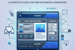
Crucial Components of an Engaging Interface
Building an effective web style requires attention to several overlapping disciplines. Let us break down the most impactful areas you need to focus on.
Typography and Readability
Text constitutes the vast majority of web content. Therefore, your typographic choices heavily influence your overall web style. Selecting the right typeface involves balancing brand personality with high legibility. Pair a character-rich font for your headings with a clean, readable sans-serif font for your body text. Ensure line heights and letter spacing allow the eye to track smoothly across the screen.
Color Palettes and Accessibility
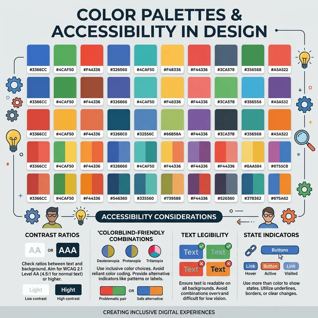
Color evokes emotion and directs attention. However, selecting a palette requires functional consideration alongside aesthetic preference. Your web style must account for users with visual impairments. Implementing accessible color contrasts ensures everyone can consume your content without strain.
You can reference the Web Content Accessibility Guidelines (WCAG) to verify that your foreground and background colors meet the necessary contrast ratios. Accessibility should never be an afterthought; it is a foundational pillar of quality design.
Spacing and Visual Hierarchy
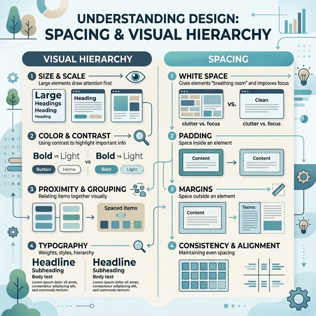
Whitespace, or negative space, gives your content room to breathe. A cluttered interface overwhelms the user, leading to high bounce rates. By utilizing generous padding and margins, your web style will naturally guide the user’s eye toward primary calls to action. Visual hierarchy ensures that the most important information stands out immediately, reducing cognitive load.
Common Mistakes to Avoid
Even experienced designers occasionally fall into formatting traps. Protect your web style by avoiding these frequent errors:
- Ignoring Mobile Users: Designing solely for desktop screens alienates a massive portion of your audience. Always adopt a mobile-first mindset.
- Overloading Animations: While motion can enhance engagement, excessive movement distracts users and slows down page loading times. Keep animations purposeful and brief.
- Inconsistent Button Styling: Using different shapes, colors, and hover states for primary actions confuses users. Standardize interactive elements.
- Poor Contrast: Gray text on a light gray background looks sleek but destroys readability. Always prioritize function over pure aesthetics.
Expert Insights and Pro Tips
To elevate your project from functional to exceptional, consider integrating these advanced strategies into your workflow.
Implement a Design System
A design system is a collection of reusable components guided by clear standards. It takes your web style from an abstract concept to a tangible toolkit. By creating a component library, you ensure that every drop-down menu, alert box, and form field remains identical across your entire application.
Optimize for Performance

Heavy image files and bloated CSS files ruin the user experience. A truly sophisticated web style looks beautiful while loading instantly. Minify your stylesheets, compress your assets, and utilize modern image formats like WebP. Google’s PageSpeed Insights provides actionable feedback on how to streamline your site’s performance without sacrificing visual quality.
Utilize Micro-interactions
Micro-interactions are subtle animations that provide feedback to the user. A button changing color upon hover or a form field displaying a soft glow when clicked confirms that the system registers the user’s action. Leveraging CSS animation frameworks can help you implement these delightful touches efficiently, bringing a polished feel to your web style.
Conclusion
Building a cohesive web style is essential for engaging visitors, improving accessibility, and building lasting brand trust. Apply these expert principles to your next project and watch your user engagement soar. Ready to transform your site? Contact our professional design team today to start creating your perfect digital experience.
Frequently Asked Questions
What exactly is web style?
It refers to the comprehensive visual and structural language of a website. It encompasses color schemes, typography, layout, spacing, and interactive elements, all working together to create a cohesive user experience and brand identity.
How does it impact SEO?
Search engines prioritize user experience. A clean, well-structured aesthetic improves readability and navigation, which decreases bounce rates and increases dwell time. These positive user signals directly contribute to higher search engine rankings.
What role does CSS play in the design process?
CSS (Cascading Style Sheets) is the coding language responsible for rendering visual designs in a browser. It allows developers to control layouts, responsive behaviors, colors, and typography independently of the website’s HTML structure.
How can I make my interface more accessible?
Focus on high color contrast, scalable typography, and clear visual hierarchies. Ensure that all interactive elements are easily clickable and that the site remains fully navigable using only a keyboard.
Why is a mobile-first approach important?
Because the majority of global internet traffic originates from mobile devices, designing for small screens first ensures your core message and functionality remain intact. You can then progressively enhance the design for larger desktop monitors.
How often should I update my site’s visuals?
While minor tweaks and optimizations should happen regularly based on user data, a complete visual overhaul is typically recommended every three to five years to ensure you meet evolving technological standards and user expectations.
What are the best tools for developing a design system?
Applications like Figma, Sketch, and Adobe XD are industry standards for creating layouts and component libraries. These tools allow teams to collaborate on the visual direction before developers write a single line of CSS.
How does typography influence the user experience?
Typography dictates readability. A poor font choice can strain the user’s eyes and cause them to abandon the site. Excellent typography establishes a clear hierarchy, making it easy for users to scan the page for the exact information they need.
Can heavy visual elements affect website loading speed?
Yes. High-resolution images, complex animations, and bloated CSS files significantly slow down page load times. It is crucial to compress assets and write clean, efficient code to maintain rapid performance.
What is a style guide and why do I need one?
A style guide is a centralized document outlining all visual standards for your brand, including hex codes, font families, and logo usage. It prevents design inconsistencies and ensures that anyone working on your website adheres to the same aesthetic rules.
I am a design enthusiast and theme developer, dedicated to creating beautiful, user-friendly website themes. Through ThemeOrbis.com, I shares tips, insights, and creative resources to help startups, bloggers, and businesses build stand-out websites.


No Comments