

Emotionally engaging website themes use color psychology and storytelling to create impactful, accessible, and conversion-focused user experiences online.
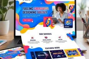
In today’s digital landscape, first impressions matter more than ever. A website’s visual theme goes beyond mere aesthetics—it forges emotional connections that influence visitor perceptions, guide actions, and build lasting loyalty. By tapping into insights from color psychology and weaving in compelling storytelling, design teams can create emotionally engaging website themes that resonate at a subconscious level, drive higher engagement metrics, and boost brand recall. In this comprehensive article, we explore how scientific research on color responses merges with narrative design to transform an ordinary site into an immersive emotional journey.
We’ll begin by examining the foundational principles of color psychology, drawing on scholarly resources such as peer-reviewed studies that uncover how hues trigger visceral reactions. Next, we’ll dive into storytelling frameworks that humanize your brand narrative and guide users along a memorable path. You’ll then discover practical tactics for applying your palette strategically within user experience flows, enhancing each interaction with micro-animations and feedback loops. Finally, we’ll address accessibility standards from W3C and testing methods to measure emotional resonance. This year, seize the opportunity to craft emotionally engaging website themes that stand out, deepen customer relationships, and deliver measurable business outcomes.
The Science Behind Color Psychology
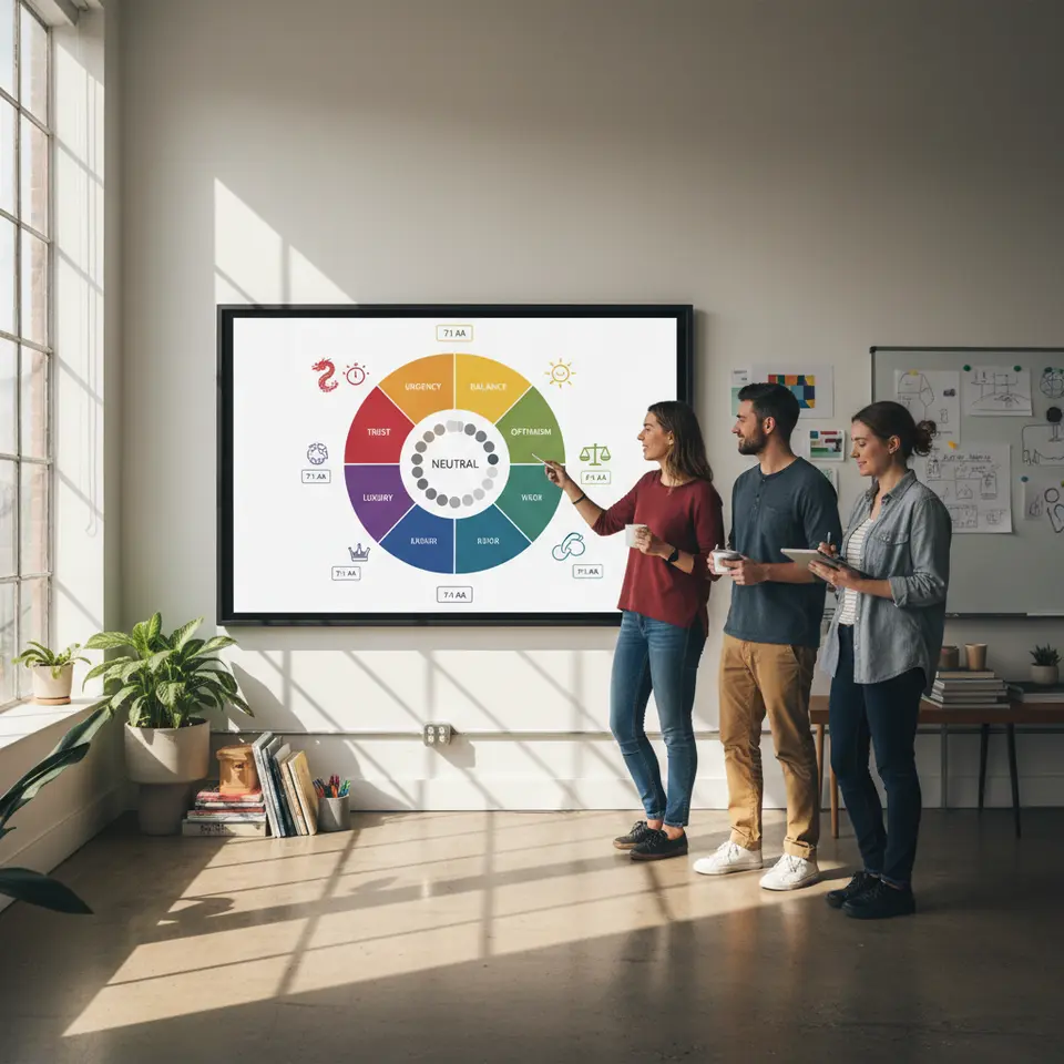
Understanding emotionally engaging website themes begins with the underlying science of color psychology. Extensive research demonstrates that colors evoke specific emotional and physiological responses within milliseconds of viewing. For instance, red often stimulates arousal and urgency, triggering increased heart rate—a tactic frequently used in calls to action. Blue, conversely, induces calmness, trust, and cognitive clarity, making it a staple in finance, healthcare, and technology sectors.
Studies indicate that green conveys balance, renewal, and health. This makes it an excellent choice for eco-conscious brands and wellness platforms. Yellow, associated with optimism and creativity, captures attention as an accent hue without overwhelming when used sparingly. Purple’s link to luxury and imagination suits premium offerings, while neutral palettes—grays, whites, blacks, and beiges—serve as harmonious backdrops that highlight accent colors.
To apply these insights effectively, limit your core palette to two or three key colors complemented by neutral tints and shades. This avoids cognitive overload and maintains visual coherence. For example, pairing a trust-inducing navy blue with a vibrant coral accent creates focus points on buttons or headlines. Subtle shading and tint variations—lighter or darker versions of primary colors—offer flexibility while preserving brand consistency. Incorporate contrast ratios that meet WCAG 2.1 guidelines (at least 4.5:1 for normal text) to ensure readability and inclusivity.
Current research also suggests cultural and demographic nuances: while red may signal good fortune in some Eastern cultures, it can represent danger in Western contexts. In today’s global marketplace, testing color associations via A/B experiments or user surveys ensures your palette aligns with audience expectations. Tools such as Adobe Color, Coolors, and advanced algorithms in academic repositories can help you generate and refine harmonious palettes grounded in empirical data.
Crafting Your Brand Narrative Through Design
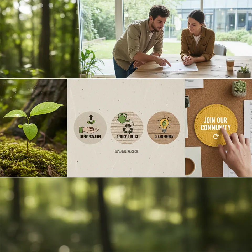
Emotionally engaging website themes do more than showcase products—they tell a story. A clear brand narrative provides context and purpose, elevating user engagement from transactional to emotional. To begin, define your brand’s core values and the problem you solve. Who is the hero of your story? In most cases, that hero is the user. Outline the journey you want them to experience—curiosity, discovery, resolution—and map this arc to visual and textual elements.
Create a mood board that blends your chosen palette with typography, imagery, and iconography. Arrange these elements in a sequential story flow: an attention-grabbing opening panel, supportive mid-section elements that build tension or highlight benefits, and a resolution point that presents your call to action. For example, an eco-friendly retailer might start with a lush green hero image of a forest sapling (representing growth), move into illustrated infographics on sustainable practices, and conclude with a vibrant yellow button inviting visitors to join a community program.
Consistent visual motifs strengthen memory retention. If unity is a core brand value, recurring circular shapes can echo that theme across backgrounds, section separators, and button borders. Typography choices also play a role—rounded sans-serif fonts feel friendly and approachable, while serif fonts suggest tradition and reliability. Maintain consistency by documenting these decisions in a style guide that outlines hex codes, font hierarchies, image treatments, and narrative guidelines. This living document serves as a reference for designers, developers, and marketers, ensuring your emotionally engaging website themes remain cohesive across pages and campaigns.
Progressive disclosure techniques—gradual reveal of content as users scroll—keep emotions aligned with the brand story. Use subtle color fades, sectional overlays, and animated transitions to guide the eye. For instance, a section might start with a grayscale background, then tint into a soft shade of your primary hue as the user scrolls, symbolizing transformation. Strategic placement of impactful quotes or testimonials can punctuate the narrative arc, further reinforcing emotional engagement.
Strategic Use of Color in UX
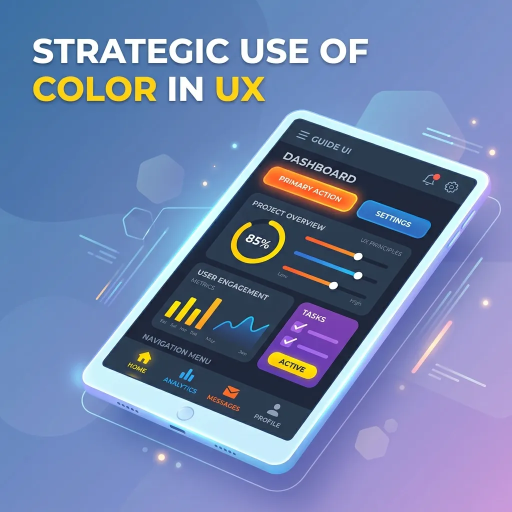
Applying color psychology in emotionally engaging website themes requires more than selecting your favorite hues—it demands strategic UX planning. Begin by identifying key interaction points: primary navigation, calls to action, form inputs, alerts, and informational graphics. Assign each element a distinct color or shade from your unified palette to create intuitive visual hierarchies.
For example, reserve your most vibrant accent color for primary buttons (“Buy Now,” “Join Free”) to attract immediate attention. Secondary actions (“Learn More,” “Read Blog”) should use a slightly muted variant. This establishes a clear priority system, guiding users effortlessly through your conversion funnel. Hover states and focus outlines provide micro-interactions that reward exploration and improve usability. A button that glows gently in your accent hue upon hover conveys responsiveness and delight.
In form design, consider color feedback loops: a soft green border indicates success, while a muted red shake signals an error. This real-time guidance reduces user frustration and improves completion rates. Loading indicators, progress bars, and skeleton screens tinted in brand colors not only reduce perceived wait times but also reinforce the emotional tone. For instance, a playful bouncing dot animation in your accent shade can alleviate impatience.
Integration of accessible color contrast is non-negotiable. Utilize contrast-checking tools to verify that all visual elements meet or exceed WCAG 2.1 standards. According to W3C accessibility guidelines, providing sufficient contrast ensures that visually impaired users experience the same emotional impact and clarity. Additionally, implement ARIA attributes and semantic HTML tags to support screen readers, making your emotionally engaging website themes truly inclusive.
Finally, supplement your visual strategy with user testing. Conduct A/B tests on color variants—measure click-through rates, time on page, and scroll depth. Use heatmaps and session recordings to observe where color draws focus or where contrast issues arise. Surveys and qualitative interviews provide insight into how your design resonates emotionally. Continuously iterate based on data to refine your palette and interaction design, ensuring your themes remain fresh and effective.
Enhancing Interaction with Micro-Interactions and Animations
Micro-interactions—small, often subtle animations—add depth and emotional resonance to user journeys. When implemented thoughtfully, they transform clicking, scrolling, and hovering from mundane tasks into delightful experiences that reinforce your brand’s tone. Consider hover effects: a button that slightly enlarges and shifts hue upon cursor entry signals interactivity and instant feedback, encouraging further exploration.
Loading animations are another opportunity to delight. Rather than a static spinner, use a progress indicator that visually ties into your brand narrative. A wellness platform might animate a leaf unfurling in the brand’s green shade, symbolizing growth during load time. These playful touches reduce perceived delays and maintain emotional engagement throughout.
Scroll-triggered reveals can guide a user through your story. As each new section enters the viewport, subtle fade-ins or slide-ins in designated accent colors draw attention to crucial points without overwhelming. Link these movements with storytelling beats: content about sustainability might slide in with an upward motion, suggesting growth, while testimonials could bounce softly to convey authenticity and warmth.
Form interactions benefit from animated feedback loops. When a user submits information successfully, display a checkmark that pulses in your success color. If an error occurs, shake the relevant field gently and highlight it in your error shade. These micro-interactions communicate status instantly, reducing cognitive load and fostering positive emotions.
To maintain performance, implement animations with CSS transitions or lightweight JavaScript libraries optimized for minimal impact on load times. Use the prefers-reduced-motion media query to respect user preferences for reduced animation. By balancing engagement with accessibility, you ensure that even users sensitive to motion can enjoy your emotionally engaging website themes.
Accessibility and Testing for Emotional Impact
Ensuring that your emotionally engaging website themes deliver consistent experiences across diverse audiences necessitates rigorous testing and adherence to accessibility standards. According to WCAG 2.1, design decisions must factor in vision, hearing, motor, and cognitive impairments. Color contrast, keyboard navigation, and clear semantic structure are foundational requirements that also enhance overall emotional clarity.
Begin with automated accessibility audits using tools like Axe, Lighthouse, or WAVE. These services identify issues with color contrast, missing ARIA labels, or problematic focus management. Follow up with manual tests: navigate your site using only a keyboard, or disable CSS to verify logical content order. Screen reader testing ensures that narrative elements and calls to action are perceivable and meaningful without visual context.
Parallel to accessibility checks, deploy user testing to measure emotional resonance. A/B experiments comparing alternate color schemes or narrative sequences reveal which combinations generate higher engagement rates, longer session durations, and increased conversions. Use analytics platforms to track scroll depth, click maps, and micro-interaction events. Supplement quantitative data with qualitative feedback via surveys or moderated interviews.
Key performance indicators (KPIs) for emotional design include bounce rate reduction, average time on page, form completion rates, and repeat visit frequency. For example, after a recent color-driven redesign, an eco-retailer saw a 32% drop in bounce rates and an 18% boost in session duration within three months. These improvements underscore how emotionally engaging website themes translate into measurable ROI.
Finally, maintain detailed documentation of testing results and design iterations. A centralized style guide that logs successful color pairings, interaction patterns, and accessibility fixes streamlines future updates. Regularly revisit and refresh your palette, narrative elements, and micro-interactions to stay aligned with evolving brand goals and user expectations.
Conclusion
Designing emotionally engaging website themes in today’s competitive environment requires a harmonious blend of color psychology, storytelling, and user-centric interactions. By grounding your color choices in scientific research, crafting a cohesive brand narrative, and enriching user flows with micro-interactions and accessible design, you elevate your site from a static presence to a dynamic emotional journey. Continuous testing against accessibility standards and performance metrics ensures your theme resonates across audiences, driving deeper engagement and tangible business outcomes.
Embrace these strategies this year to cultivate authentic emotional connections, strengthen brand loyalty, and achieve sustainable growth. Experiment boldly with palette variations, iterate on narrative arcs, and monitor user feedback to refine your approach. With each color choice and animation, you have the power to guide users toward meaningful interactions and lasting impressions. Start today, and transform your website into an emotionally engaging experience that captivates and converts.
FAQ
What are emotionally engaging website themes?
Emotionally engaging website themes are designs that use color psychology, storytelling, typography, and visual hierarchy to create emotional responses that influence user behavior and improve engagement.
How does color psychology affect website users?
Color psychology influences mood and perception. For example, blue builds trust, red creates urgency, and green represents balance. These emotional triggers help guide user decisions and actions on a website.
Why is storytelling important in web design?
Storytelling makes a website more relatable by guiding users through a narrative journey. It helps communicate brand values, build emotional connection, and improve user retention.
How many colors should a website theme use?
Most effective website themes use 2–3 primary colors with supporting neutral shades. This keeps the design visually consistent and avoids overwhelming users.
What role do micro-interactions play in emotional design?
Micro-interactions provide feedback and enhance user experience. Small animations like hover effects or loading indicators make the interface feel more interactive and engaging.
How can I test emotional engagement on my website?
You can use A/B testing, heatmaps, user surveys, and analytics tools to measure engagement metrics like click-through rate, bounce rate, and time on page.
Why is accessibility important in color-based design?
Accessibility ensures all users, including those with visual impairments, can interact with your site. Proper contrast ratios and WCAG compliance make designs inclusive and readable.
Can storytelling improve conversion rates?
Yes. A strong narrative guides users emotionally through the website, builds trust, and encourages actions like sign-ups, purchases, or inquiries.
What tools help in choosing website color palettes?
Tools like Adobe Color, Coolors, and Figma help designers create balanced, accessible, and psychologically effective color schemes for websites.
How often should I update my website theme?
It’s recommended to refresh your theme every 1–2 years or whenever branding, user behavior, or technology trends significantly change.
Mary McElwee is an editor at ThemeOrbis, specializing in creating and refining content around WordPress themes, web design, and digital creativity. She simplifies complex design and development concepts into clear, practical insights that help users build modern, responsive, and high-performing websites with ease.


No Comments