
This comprehensive guide explores the psychology, strategic implementation, and best practices for creating stunning orange themed websites. You will discover actionable UX/UI techniques, color pairing strategies, industry examples, and expert tips to ensure your energetic designs remain highly accessible, user-friendly, and perfectly aligned with your brand identity.
When designers choose to build orange themed websites, they tap into a specific range of psychological triggers. Orange is a secondary color, born from the passion of red and the joy of yellow. This combination makes it a highly stimulating hue that encourages communication, optimism, and action.
Why Choose Orange?
Selecting the right color palette is the foundation of successful web design. Orange stands out because it naturally radiates warmth and approachability. Unlike red, which can sometimes signal danger or urgency, orange feels inviting. It encourages users to explore, engage, and interact without feeling pressured. Brands that use orange want to be seen as friendly, innovative, and confident.
For digital interfaces, orange themed websites break the monotony of standard corporate blues and minimalist grays. They inject life into a webpage, ensuring that the brand is memorable. Whether you use a soft peach or a vibrant neon tangerine, orange communicates enthusiasm.
Emotional Triggers and Brand Perception
Different shades of orange evoke different emotional responses. A bright, saturated orange yells excitement and youthfulness. A burnt orange or terracotta feels earthy, grounded, and rustic. Understanding these subtle psychological shifts helps you tailor orange themed websites to your specific target audience.
Users often associate orange with affordability and value, which is why massive e-commerce platforms like Amazon and Home Depot frequently use it for their call-to-action buttons. By understanding these emotional triggers, you can strategically place orange elements to guide user behavior and shape how consumers perceive your business.
When to Use Orange Themed Websites for Your Brand
Not every brand should use a fully orange interface. Knowing when and where to deploy this powerful color dictates the success of your web project. Orange themed websites perform exceptionally well in specific contexts but require careful handling in others.
Industries That Thrive with Orange
Certain industries naturally align with the energetic vibe of orange themed websites:
- Tech Startups and SaaS: Innovative companies use orange to showcase disruption and forward-thinking mentalities. It stands out against traditional corporate tech colors.
- Food and Beverage: Orange stimulates appetite. Websites selling snacks, energy drinks, or meal delivery services use orange to trigger hunger and excitement.
- Fitness and Health: Representing energy and movement, orange is perfect for gym websites, personal trainers, and sports apparel brands.
- Creative Agencies: Design firms and marketing agencies build orange themed websites to demonstrate their bold, outside-the-box creativity and willingness to take risks.
- E-commerce and Retail: Because orange encourages impulse buying and signifies value, online stores frequently utilize it to drive quick purchasing decisions.
Orange vs. Other Warm Colors
|
Color Choice |
Primary Emotion |
Best Used For |
Risk Factors |
|---|---|---|---|
|
Orange |
Enthusiasm, Creativity |
Tech, Fitness, Food, Agencies |
Can be overwhelming if heavily saturated. |
|
Red |
Urgency, Passion |
Clearance sales, Error states, Cars |
Can induce anxiety or signal danger. |
|
Yellow |
Joy, Caution |
Children’s products, Warnings |
Extremely hard to read against white backgrounds. |
Choosing orange over red or yellow gives you a balanced, warm tone that encourages interaction without the harshness of red or the readability issues of yellow.
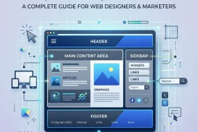
Essential Design Principles for Orange Themed Websites
Building orange themed websites requires a deep understanding of UI/UX design principles. Because it is such a dominant color, you must balance it carefully to maintain a pleasant user experience.
Choosing the Right Shade of Orange
The exact hex code you select will define the entire mood of your website.
- Vibrant Tangerine (#FF8C00): Perfect for modern tech brands and fitness apps. It pops beautifully against dark backgrounds.
- Burnt Orange (#CC5500): Ideal for rustic brands, interior design portfolios, or organic food websites. It feels warm and established.
- Soft Peach (#FFDAB9): Great for wellness brands, beauty products, and lifestyle blogs. It provides a gentle, soothing backdrop.
Pairing Colors: Complementary and Analogous Palettes
Orange themed websites never rely on orange alone. You need a robust color palette to create visual harmony.
- Complementary Colors: Blue is the direct complement to orange. Pairing a bright orange with a deep navy blue or a vibrant teal creates maximum contrast and visual interest.
- Analogous Colors: Using colors next to orange on the color wheel, such as reds and yellows, creates a fiery, cohesive look.
- Neutral Pairings: To let the orange truly shine, pair it with crisp whites, cool grays, or stark blacks. Dark mode interfaces with neon orange accents are currently highly popular in modern web design.
To explore deeper color pairing theories, you can review resources from the Adobe Color Wheel which helps designers generate mathematically perfect color schemes.
Utilizing White Space Effectively
When designing orange themed websites, negative space (or white space) becomes your best friend. Orange is loud. If you pack an orange page with too much text, heavy images, and cluttered navigation, you will visually exhaust your user. Generous white space gives the eyes a place to rest, making the bright orange elements feel purposeful and stylish rather than chaotic.
Best Practices for Creating Orange Themed Websites
To ensure your vibrant website actually performs well and ranks high on search engines, you must adhere strictly to established UI/UX best practices.
Accessibility and Contrast Guidelines
One of the biggest challenges with orange themed websites is ensuring accessibility. The Web Content Accessibility Guidelines (WCAG) dictate strict contrast ratios to ensure visually impaired users can read your content. White text on a light orange background often fails contrast checks.
- Always test your orange and white combinations.
- If using a bright orange background, opt for dark gray or black typography.
- If you must use white text, darken the shade of your orange to a burnt or rust tone to increase the contrast ratio.
Using Orange for Call-to-Action (CTA) Buttons
Even if you do not build entirely orange themed websites, using orange for your primary CTA buttons is a proven conversion rate optimization (CRO) strategy. Because orange contrasts heavily with most standard web colors (like blue, green, and white), an orange button immediately draws the eye.
- Make your “Buy Now” or “Sign Up” buttons a vibrant shade of orange.
- Ensure the button has ample breathing room around it.
- Keep the text inside the button concise and action-oriented.
Typography Choices That Match Vibrant Backgrounds
Typography on orange themed websites needs to be highly legible. Thin, delicate serif fonts can easily get lost on a bright orange background.
- Use bold, geometric sans-serif fonts for headings to match the modern, energetic feel of the color.
- Ensure body copy is large enough (at least 16px to 18px) to reduce eye strain.
- Stick to dark gray (#333333) rather than pure black (#000000) for text on orange backgrounds, as it slightly reduces the harshness while maintaining excellent readability.
Mini-Conclusion: By focusing on contrast, white space, and bold typography, you transform a potentially overwhelming orange design into an elegant, high-performing digital asset.
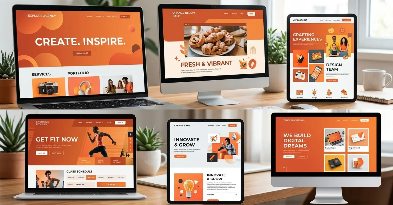
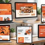
Real-World Inspiration: Successful Orange Themed Websites
Looking at top-performing digital interfaces provides excellent inspiration for your own projects. Many award-winning platforms leverage orange to stand out from their competitors. Platforms showcasing web design trends, such as Awwwards, frequently feature websites that use bold colors to break conventional molds.
Creative Agencies and Portfolios
Many independent designers and creative agencies use orange themed websites to show off their personality. By employing a bright orange background with massive, bold black typography and brutalist design elements, they signal to potential clients that they are fearless, modern, and highly creative.
Tech Startups and SaaS Platforms

Software companies often use a deep blue or dark mode aesthetic with bright, neon orange accents. This approach highlights interactive elements, pricing tables, and product features without overwhelming the user. The orange acts as a guide, leading the user’s eye down the sales funnel.
E-commerce and Retail Brands

Think of brands that sell outdoor gear or sports equipment. They frequently use orange themed websites to convey ruggedness and energy. High-quality product photography featuring people running, hiking, or climbing looks spectacular when framed by energetic orange UI elements.
Step-by-Step Guide to Building Orange Themed Websites
If you are ready to design your own vibrant interface, follow this systematic approach to guarantee a professional result.
Step 1: Define Your Brand Voice
Before touching a design tool, clarify what your brand represents. Are you youthful and playful? Professional and bold? Earthy and organic? Your brand voice will dictate the exact shade of orange you need to use.
Step 2: Select a Primary Orange Hex Code
Use a color picker to find your anchor color. Do not guess. Find a hex code that aligns with your brand identity and stick to it strictly to maintain consistency across all pages and marketing materials.
Step 3: Build a Supporting Palette
Generate a color palette that supports your primary orange. Choose a background color (usually white, off-white, or dark navy), a text color (dark charcoal), and an accent color (perhaps a complementary teal or analogous yellow).
Step 4: Map Out Your User Journey
Determine where you want users to click. Reserve your brightest orange exclusively for these high-priority interactive elements. If everything is bright orange, nothing stands out.
Step 5: Test Across Devices
Orange can render differently on different monitors and mobile screens. Test your orange themed websites on various displays to ensure the color remains vibrant and does not shift into muddy browns or neon yellows.
Mini-Conclusion: Following a structured design phase ensures that your use of color remains intentional, driving user engagement rather than causing visual fatigue.
Expert Insights and Pro Tips
To truly master the creation of orange themed websites, consider these advanced strategies used by senior UX/UI designers:
- Use Gradients: Flat orange can sometimes look dated. Incorporate subtle gradients, blending a bright tangerine into a soft peach, to add depth and modern flair to your backgrounds.
- Leverage Micro-interactions: Make your orange elements come alive. Have orange buttons slightly change shade or cast a soft orange drop-shadow when a user hovers over them.
- Monochromatic Images: Pair orange backgrounds with black-and-white photography. This creates a striking, editorial look that elevates the perceived value of your brand.
- The 60-30-10 Rule: Apply this classic design rule. Make 60% of your site a neutral color (like white), 30% a secondary color (like dark gray), and use your vibrant orange for the remaining 10% to create perfect harmony.
Common Mistakes to Avoid
Even experienced developers can falter when working with bold colors. Avoid these critical errors when building orange themed websites.
- Ignoring Color Contrast: Placing white, thin text over a bright orange background is the most common mistake. It violates accessibility standards and frustrates users.
- Overwhelming the User: Using orange for the background, the buttons, the text, and the borders creates visual chaos. Restraint is crucial.
- Clashing Colors: Pairing orange with neon green or bright magenta without proper balancing creates a harsh, vibrating effect on the screen that will cause users to immediately bounce from your site.
- Ignoring Context: Using a playful, bright orange for a serious medical facility or a corporate law firm creates a jarring disconnect between the brand’s purpose and its visual identity.
Conclusion
Designing striking orange themed websites requires a delicate balance of color theory, psychological understanding, and strict adherence to accessibility standards. When executed correctly, these vibrant interfaces capture attention, boost engagement, and create memorable brand experiences.
Ready to elevate your digital presence? Start experimenting with bold orange palettes today, apply these proven UX best practices, and watch your website transform into a high-converting, energetic platform.
Frequently Asked Questions
What does the color orange represent in web design?
In web design, orange represents energy, creativity, enthusiasm, and warmth. It is a highly stimulating color that encourages user action, making it incredibly effective for highlighting important information and call-to-action buttons.
Are orange themed websites good for e-commerce?
Yes, they are highly effective. Orange conveys a sense of affordability, value, and urgency. Many successful online retailers use orange elements to guide shoppers toward making quick, confident purchasing decisions.
How do I make text readable on an orange background?
To ensure readability, use high-contrast text colors like dark charcoal or black. Avoid using pure white text on bright orange backgrounds, as it often fails WCAG accessibility contrast requirements and strains the eyes.
What colors pair best with orange in web design?
Blue is the complementary color to orange, creating a striking and vibrant contrast. Additionally, orange pairs beautifully with neutral tones like white, dark gray, and black, which help the orange elements pop without overwhelming the screen.
Is orange a good color for B2B websites?
It depends on the industry and the brand identity. While traditional B2B companies often lean toward conservative blues, modern SaaS platforms, marketing agencies, and disruptive tech startups use orange to appear innovative, bold, and approachable.
Can I use multiple shades of orange on one website?
Yes, using a monochromatic palette with various shades of orange can create a deep, cohesive design. However, you must ensure there is enough contrast between the different shades to distinguish separate UI elements clearly.
Why do so many sites use orange for CTA buttons?
Orange naturally draws the human eye because of its warmth and vibrancy. Since it contrasts well with the blues, greens, and whites commonly used for website backgrounds, an orange button easily stands out as the primary action point.
What is the 60-30-10 rule in website color schemes?
The 60-30-10 rule is a design principle where 60% of the page uses a primary neutral color, 30% uses a secondary color, and 10% uses a bold accent color (like orange) to guide the user’s attention to specific interactive elements.
How does dark mode work with orange themed websites?
Dark mode pairs incredibly well with orange. A deep black or dark charcoal background allows neon or vibrant orange accents to glow, creating a highly modern, sleek, and premium aesthetic popular in tech and gaming industries.
What are the biggest mistakes when designing with orange?
The most common mistakes include ignoring accessibility by using low-contrast text, overwhelming the user by applying orange to too many elements, and choosing a shade of orange that conflicts with the psychological message of the brand.
I am a design enthusiast and theme developer, dedicated to creating beautiful, user-friendly website themes. Through ThemeOrbis.com, I shares tips, insights, and creative resources to help startups, bloggers, and businesses build stand-out websites.


No Comments