
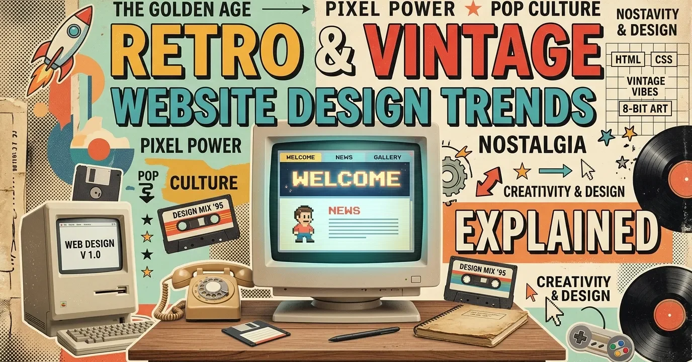
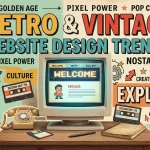
This guide breaks down exactly how retro & vintage website design trends impact user engagement. You will learn to integrate nostalgic typography, classic color palettes, and analog textures. Master these techniques to build modern websites that stand out and deeply resonate with users.
The digital landscape is flooded with minimalist, ultra-modern interfaces. While clean, this widespread uniformity can feel sterile. Retro & vintage website design trends provide a much-needed break from the ordinary. By pulling visual cues from the 70s, 80s, and 90s, brands can forge an immediate emotional connection with their visitors.
The Psychology of Nostalgia in UI
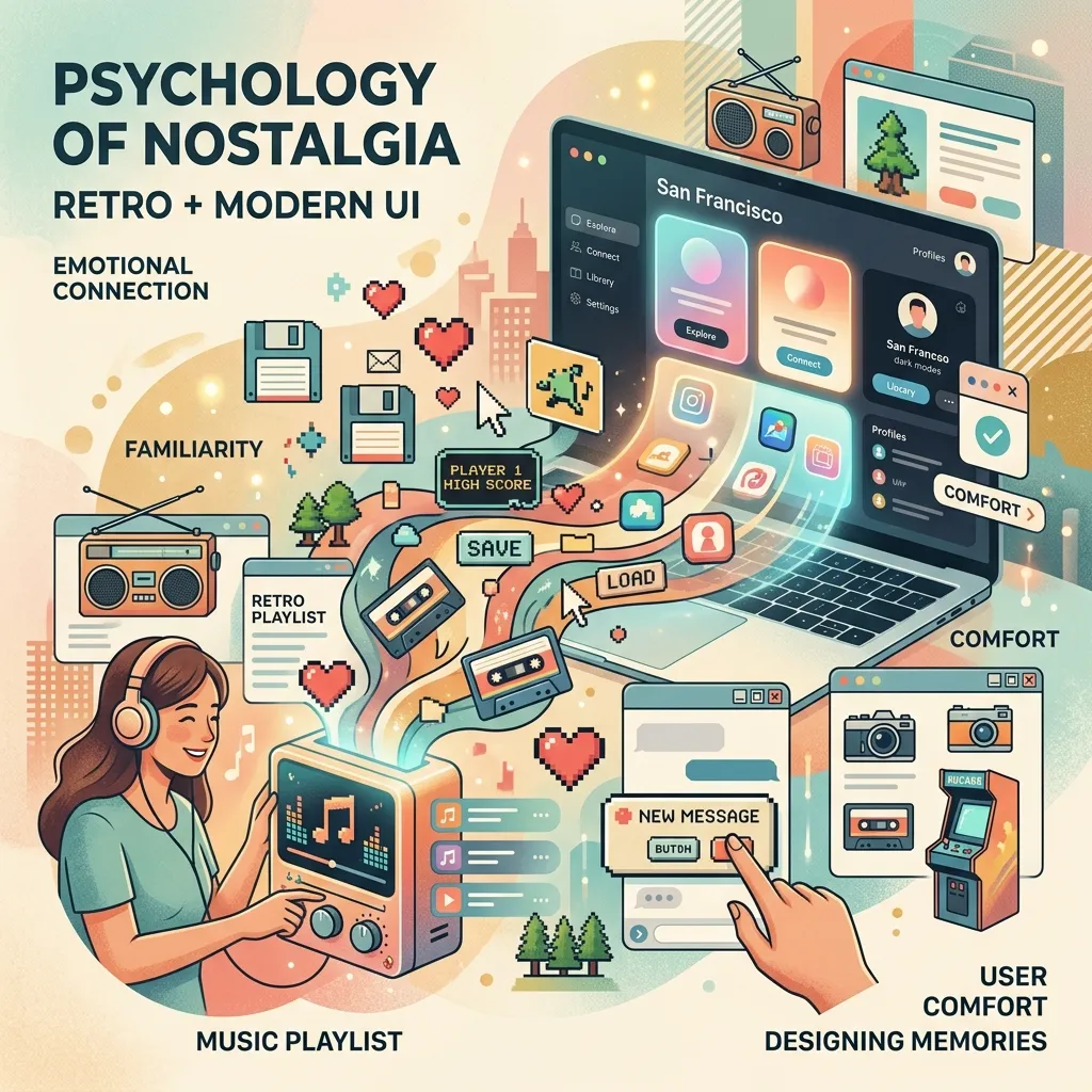
Nostalgia provides comfort. When users encounter familiar visual cues from their youth, their brains release dopamine. This emotional response builds instant trust. By integrating these retro & vintage website design trends, you are not just building a site; you are crafting a welcoming environment that encourages longer browsing sessions and higher engagement. Integrating solid branding strategies with these nostalgic elements ensures your site feels both authentic and purposeful.
Balancing Old-School Aesthetics with Modern UX
The golden rule of nostalgic design is to look old but act new. A site that looks like it belongs in 1998 should not load like it is on a dial-up connection. You must maintain excellent load speeds, mobile responsiveness, and intuitive navigation. Following guidelines from UX authorities like the Nielsen Norman Group ensures your retro designs remain fully functional for modern users.
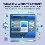
Core Elements of Retro & Vintage Website Design Trends
To successfully pull off a vintage look, you must master a few foundational design elements.
Typography That Tells a Story
Typography is the backbone of any retro aesthetic. Swap out standard sans-serif fonts for chunky serifs, pixelated typefaces, or elaborate scripts.
- 70s Vibe: Use thick, curvy, and groovy fonts.
- 80s Vibe: Opt for neon, futuristic, or arcade-style block letters.
- 90s Vibe: Embrace grunge or early-web pixel fonts.
You can find excellent options for nostalgic typefaces on platforms like Google Fonts.
Color Palettes Inspired by the Past
Color dictates the mood of your website. Vintage palettes often rely on muted tones or hyper-saturated neons, depending on the chosen era. A 70s-inspired site might feature mustard yellow, burnt orange, and avocado green. Conversely, an 80s cyberpunk aesthetic will lean heavily on neon pink, cyan, and deep purple.
Textures, Grain, and Analog Touches
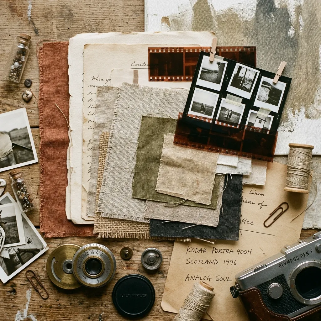
Modern screens display millions of crisp colors. To create an authentic vintage feel, you must reintroduce imperfection. Add film grain, halftone patterns, paper textures, or subtle noise overlays to your backgrounds and images. This tactile quality grounds your digital design in the physical world.
Actionable Strategies to Implement These Styles
Ready to build your nostalgic site? Follow these steps to ensure a cohesive and engaging user experience.
Step 1: Choose Your Era
Do not mix aesthetics from different decades randomly. Decide if your brand aligns better with 60s psychedelia, 80s arcade culture, or 90s brutalism. Consistency is key to maintaining strong UI/UX fundamentals.
Step 2: Source Authentic Assets
Use high-quality design assets to build your aesthetic. Explore award-winning designs on platforms like Awwwards to see how top agencies source and implement vintage illustrations, icons, and textures.
Step 3: Prioritize Accessibility
Low contrast and complex fonts can create barriers for users with disabilities. Always ensure your text meets the contrast ratios outlined by the W3C Web Accessibility Initiative.
Comparison: 80s Cyberpunk vs. 90s Brutalism
|
Feature |
80s Cyberpunk |
90s Brutalism |
|---|---|---|
|
Color Palette |
Neon pinks, cyans, dark backgrounds |
Web-safe blues, bright reds, stark white |
|
Typography |
Synthwave scripts, glowing block letters |
Times New Roman, basic pixel fonts |
|
Visual Elements |
Grid lines, lasers, VHS glitches |
Exposed HTML tables, raw borders, low-res GIFs |
|
Overall Mood |
Futuristic, energetic, night-time |
Rebellious, raw, anti-design |
Common Mistakes to Avoid
- Sacrificing Readability: Do not let a cool vintage font ruin your user experience. Keep body text highly legible.
- Ignoring Mobile Users: Complex textures and custom cursors often break on mobile devices. Always design with a mobile-first approach.
- Overloading the Page: Too many GIFs, heavy textures, and auto-playing audio will skyrocket your bounce rate.
- Forgetting Brand Alignment: Only use these trends if they actually make sense for your target audience and product.
Expert Insights & Pro Tips
- Use CSS over Images: Whenever possible, create retro effects (like drop shadows, borders, and gradients) using CSS rather than heavy image files to keep load times low.
- Micro-interactions Matter: Add subtle hover effects, like a button pushing down with a satisfying “click” animation, to enhance the tactile feel of the site.
- Test for Conversions: Monitor your analytics closely. If your vintage aesthetic is hurting your conversion rate optimization, simplify the design near your checkout or contact forms.
The Future of Nostalgic Web Design
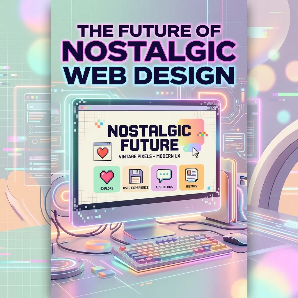
As technology advances into augmented reality and spatial computing, the desire for grounded, nostalgic digital spaces will only increase. By mastering these retro & vintage website design trends, you position your brand to offer a comforting, memorable oasis in an increasingly complex digital world.
Mastering the Art of Nostalgic Digital Spaces
Embracing retro & vintage website design trends allows you to build unique, emotionally engaging platforms. By blending nostalgic visual elements with modern functionality, you create experiences that captivate visitors. Ready to transform your site? Start experimenting with classic aesthetics today and watch your engagement soar.
FAQs
1. What are retro & vintage website design trends?
These trends involve incorporating visual elements from past decades—such as the 70s, 80s, or 90s—into modern web interfaces. This includes using nostalgic typography, analog textures like film grain, and era-specific color palettes.
2. How do I choose the right retro era for my brand?
Analyze your target audience and core brand values. If you sell artisanal coffee, a warm 70s aesthetic might work perfectly. If you run a tech startup, 80s synthwave or 90s early-web styles might align better with your audience.
3. Can vintage design impact site speed?
Yes, if implemented poorly. Heavy image files used for textures or custom cursors can slow down your site. To mitigate this, compress all images and use CSS to generate visual effects whenever possible.
4. Are nostalgic websites accessible?
They can be, but you must be careful. Vintage designs often utilize low-contrast colors and complex fonts. Always adhere to WCAG guidelines by ensuring high contrast ratios and providing alternative text for decorative images.
5. What is 90s web brutalism?
Web brutalism is a design style that mimics the raw, unpolished look of the early internet. It features exposed HTML tables, standard web-safe colors (like bright blue links), Times New Roman fonts, and a distinct lack of modern spacing or shadows.
6. How do I find vintage typography?
Numerous online repositories offer excellent vintage fonts. Google Fonts provides great free options, while foundries like Adobe Fonts or independent type designers offer specialized, era-specific typefaces for commercial use.
7. Is retro design suitable for eCommerce?
Absolutely. However, the checkout process must remain modern and frictionless. Use nostalgic design for your homepage, product pages, and marketing banners, but keep the actual purchasing flow clean and straightforward to maximize conversions.
8. How does nostalgia affect conversion rates?
Nostalgia triggers positive emotional responses, which builds trust and keeps users on your site longer. When users feel a connection to your brand, they are significantly more likely to subscribe, engage, or make a purchase.
9. What colors work best for a 70s aesthetic?
A 70s color palette relies heavily on earthy, muted tones. Think mustard yellow, burnt orange, avocado green, and warm browns. These colors evoke a sense of warmth, nature, and analog media.
10. How do I balance retro looks with modern UX?
Keep the navigation intuitive and standard. Use nostalgic elements purely for aesthetic dressing—like background textures, headline fonts, and color choices—while ensuring that buttons, menus, and forms behave exactly as a modern user expects.
I am a design enthusiast and theme developer, dedicated to creating beautiful, user-friendly website themes. Through ThemeOrbis.com, I shares tips, insights, and creative resources to help startups, bloggers, and businesses build stand-out websites.


No Comments